Compressive Images
April 2020 note: Hi! Just a quick note to say that this post is pretty old, and might contain outdated advice or links. We're keeping it online, but recommend that you check newer posts to see if there's a better approach.
Here at Filament Group, we’ve invested a great deal of time thinking about how best to deliver images that look sharp on devices from a low-resolution phone to High-resolution (HD) screens like Apple’s Retina™ or the new Nexus 10, while being as lightweight as possible for performance. In practice, this is more difficult than it may sound, as there is currently no native HTML solution to deliver different versions of an image, so we resort to JavaScript or server-side workarounds to achieve a similar result.
This week we came across an interesting technique. In his article titled Retina Revolution, Daan Jobsis shared the following premise: when considering a jpeg image’s file size, the level of compression makes more of a difference than its physical dimensions. In other words, given two identical images that are displayed at the same size on a website, one can be dramatically smaller than the other in file size if it is both highly compressed and dramatically larger in dimensions than it is displayed.
While we’re not sure it stands to replace the responsive image techniques currently in play, we are very excited about its potential for complementing them. The article discusses the technique’s “retina” implications, though in practice, the approach may have much more potential than differentiating high resolution “retina” (HD) and standard definition (SD) screen density alone.
An example comparison
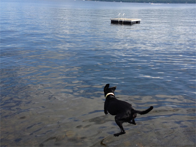
Let’s look at an example. Both images below are displayed at 400 pixels width and 300 pixels height.
This first image is saved with those dimensions specifically (it’s displayed at 100% size), with a typical 90% quality jpeg compression from Photoshop. It weighs 95kb.
This second image, however, is actually scaled down by the browser. Its natural size is 1024x768px, but its compression was set to 0 (zero!) quality when saved from Photoshop. As a result, it weighs 44kb.
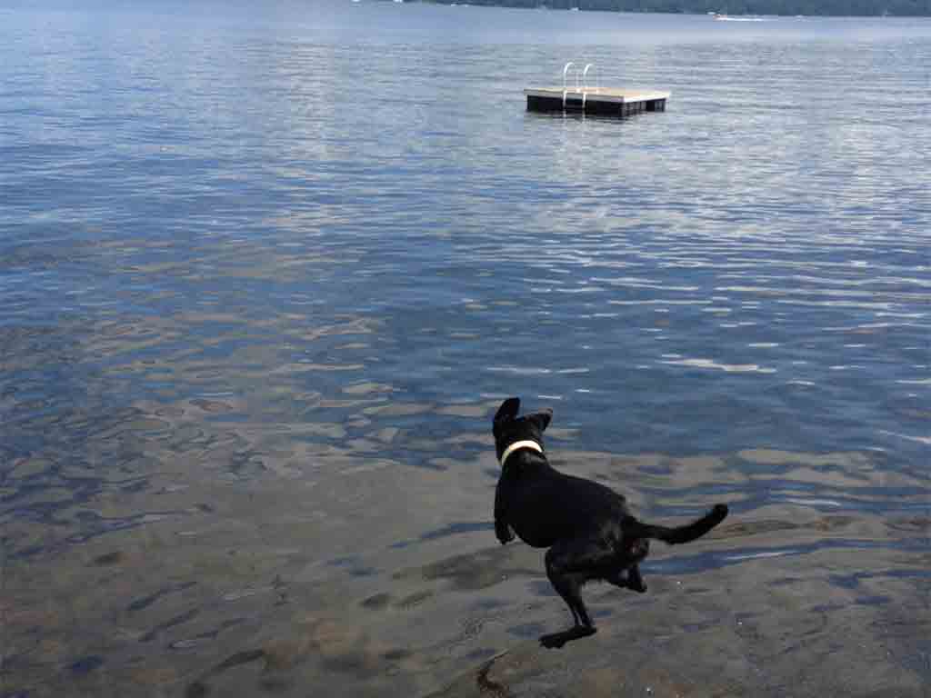
The images look roughly similar in quality, yet the second one is less than half the weight. Since that image is more than twice the resolution of the display size, it also looks sharp on retina screens.
Implications
Assuming there aren’t drawbacks we’ve yet to consider (and there usually are), we’re unsure how this affects our current thinking on responsive images.
For one thing, we’re sure that this does not entirely replace the features of the proposed picture element. For example, picture’s ability to deliver different image sources altogether means we can provide different crops of an image depending on the size, and a single image can’t currently do that. In this context, it’s possible that we might use this technique to reduce the size of those sources.
Still, for images that are merely delivered at different sizes without any changes to the crop, this technique could present a much simpler solution.
Regardless, we think it’s a pretty interesting twist. We’d love to hear your thoughts!
Note: Daan has posted a followup article worth reading as well.