Responsive Images: Experimenting with Context-Aware Image Sizing
April 2020 note: Hi! Just a quick note to say that this post is pretty old, and might contain outdated advice or links. We're keeping it online, but recommend that you check newer posts to see if there's a better approach.
 Responsive
Web Design has been a very hot topic this year, inspiring developers who
long for a “one codebase serves all” future. But critics of the
technique have pointed out several issues that need to be addressed
before it can scale perfectly from handheld to desktop — specifically,
while HTML, CSS and JavaScript can be light enough to share across all
experiences, desktop-optimized images are often too heavy for mobile
connections, and mobile-optimized images are too low quality for desktop
viewers.
Responsive
Web Design has been a very hot topic this year, inspiring developers who
long for a “one codebase serves all” future. But critics of the
technique have pointed out several issues that need to be addressed
before it can scale perfectly from handheld to desktop — specifically,
while HTML, CSS and JavaScript can be light enough to share across all
experiences, desktop-optimized images are often too heavy for mobile
connections, and mobile-optimized images are too low quality for desktop
viewers.
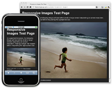
Recently, we began work on a large-scale responsive design (collaborating with the incredibly talented Mr. Ethan Marcotte, who notably got this whole “responsive” party started), in which we’ve set out to address this shortcoming of responsive design with a technique that requests an appropriate image size for a given context without resorting to tactics like User Agent sniffing. We feel strongly that these responsive techniques present a most practical way forward in web development. This post documents our in-progress experiment with “Responsive Images.”
What is this all about?
Permalink to 'What is this all about?'The goal of this technique is to deliver optimized, contextual image sizes for responsive layouts that utilize dramatically different image sizes at different resolutions. Ideally, this approach will allow developers to start with mobile-optimized images in their HTML and specify a larger size to be used for users with larger screen resolutions — without requesting both image sizes, and without UA sniffing.
How’s it work?
Permalink to 'How’s it work?'The technique consists of a few key files: rwd-images.js, rwd.gif,
and some .htaccess directives. To use, just drop the .htaccess file
into your root web directory (this requires an Apache web server, and if
you already have an .htaccess file, you can paste its contents into your
existing file), and reference rwd-images.js from an HTML page.
Any images that you’d like to scale and load responsively should start
by referencing a mobile-friendly image size, adding a “.r” prefix to the
file extension, and reference a larger size using a HTML5 custom
attribute data-fullsrc (the image referenced by data-fullsrc will be
used for screen resolutions greater than 480px).
<img src="small.r.jpg" data-fullsrc="large.jpg">
As that page loads, the rwd-images.js script inserts a BASE element
into the head of your page, directing all subsequent image, script, and
stylesheet requests through a fictitious directory called
"/rwd-router/". As these requests reach the server, the .htaccess file
determines whether the request is a responsive image or not. It
redirects responsive image requests temporarily to rwd.gif (a
transparent 1px gif image), while all non-responsive image requests go
to their proper destination through a URL rewrite that ignores the
"/rwd-router/" segment. When the HTML finishes loading, rwd-images.js
removes the BASE element from the DOM (resetting the base URL) and sets
the responsive image sources to either their small or large size (if
specified), depending on whether the screen resolution is greater than
480px.
We’ve found that the technique works in most modern browsers (Safari (desktop, iPhone, iPad), Chrome, Internet Explorer (8+), Opera). The technique degrades gracefully in other browsers, such as IE7 and under. In those browsers, desktop users will still receive an appropriate image size, but the mobile image will download as well, causing slight but unfortunate overhead. As development continues, we may find a workaround to bring full support to these browsers.
Usage Instructions, Documentation, and Ongoing Development
Permalink to 'Usage Instructions, Documentation, and Ongoing Development'We’re still experimenting with this technique, and we’re looking for contributions and ideas. To read more about the project, or to fork the project and contribute, please check out our project on Github. While you’re there, check out the issue tracker to see the problems we’re currently working out.