Labels Required
Late last year we completed an accessibility audit with a client, during which we were reminded that form fields must have properly associated label elements to be universally understood by screen readers and conventional browsers. We generally use label to mark up form fields, but occassionally use a few other valid ways to identify a field — ways that we felt confident were screen reader friendly, like aria-label. So why should we use a label in all cases? I decided to dig into why and how we should be using label instead of relying on elements or attributes with similar, but limited, qualities.
(If you need a refresher on label markup, MDN has a good form structure tutorial.)
What’s so special about the label?
Permalink to 'What’s so special about the label?'
Using the label element checks all of the boxes for inclusivity when properly formatted: it’s directly associated with a form element (either with the for attribute or by nesting the element inside the label), displayed as text by standard browsers, and spoken by screen readers. Clicking or tapping on a label will focus the associated element (or select the checkbox or radio option), and when you focus directly on the element, screen readers will read the label. Ensuring that both visual and auditory cues are present and intelligible are critical when you consider that in WebAIM’s annual screen reader study screen reader users report relying on a mix of both, with the majority using audio exclusively.
It’s possible to use markup other than label, but when you do, users may see or hear blank form elements and have no idea what to enter. To illustrate, I tested the following inputs — one using a div, one with a label — in 3 screen readers, all with default settings: NVDA 2018 (Windows), VoiceOver (Mac), and VoiceOver (iOS). I kept the style and markup simple, for science:
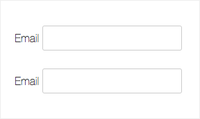
<div>Email <input class="form-control" type="email"></div>

<label>Email <input class="form-control" type="email"></label>
VoiceOver reads both examples the same way: “Email, edit text” (Mac) or “Email, text field” (iOS). Despite that div has no meaningful semantics, VoiceOver interprets the “Email” text as a label.
NVDA, on the other hand, treats them differently. It ignores the div example’s text and reads “edit, blank”; when it encounters the input with label, it reads “Email, edit, blank”. (It’s probably worth noting that NVDA is ranked by WebAIM’s survey as the second most popular screen reader; VoiceOver is a distant third.)
During this test I also learned:
- None of these screen readers identify the specified “email” type value. They translate HTML5 input types like “email” and “search” into “text”; any numeric or date inputs are read as “stepper” (VoiceOver) or “spin button” (NVDA). One exception: VoiceOver on iOS will identify a “search field”, but no other types. Generally, we can’t rely on the
typeattribute to inform screen readers, just as we can’t rely on it to render uniformly across conventional browsers. - When
labelelements are used without text, some screen readers can identify the wrong element, so proper formatting with text is key.
But there are cases where we want to hide label text so that more form elements fit on the screen, or when we want to avoid redundant field identifiers. It’s fairly common to see placeholder or aria-label attributes used as de facto labels when real estate is scarce and hiding extra text from view makes sense (see: most search fields and login forms). Let’s see how they stack up.
The placeholder attribute
Permalink to 'The placeholder attribute'At first glance, placeholder does a very similar job to label: it’s displayed as text (within text inputs, specifically) and read aloud by screen readers. As an attribute of the text input, there’s no mistaking which field it belongs to.
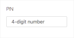
<label>
	<span class="label-text">PIN</span>
	<input class="form-control" type="text" placeholder="4-digit number">
</label>
The placeholder has a purpose, though, that diverges from that of a label. It’s meant to be a suggestion, formatting guideline, or hint that is ultimately replaced by user input. So while a placeholder may seem like a worthy label alternate on the first pass through a form, once a data value is entered, that label is gone. And that’s just one of several reasons why placeholder is an inadequate substitute label. It’s much more valuable when used as a guide.
The aria-label attribute
Permalink to 'The aria-label attribute'The aria-label attribute provides label text to screen readers for identifying interactive elements, or elements with ARIA roles, and it produces the same audio feedback as the label element. There’s no reason to use both on the same form field, and we actually recommend against trying. Out of curiousity, I tested both on the same field and each screen reader read the combination of label, aria-label, and placeholder text differently: NVDA omits the placeholder, VoiceOver (Mac) omits the label text, and VoiceOver (iOS) omits the aria-label. It’s best to choose a single labelling method.
To that end, consider that aria-label is limited in 2 important ways when it’s used in place of a standard label:
- it doesn’t display any text, so you’d need to use a separate text element for sighted users. I’ve seen
placeholdertext or default values used witharia-labelto provide the visual piece, but as noted earlier, these values are intended to change with user input. - more imporantly, the standard implementation of ARIA attributes continues to be a work in progress for both conventional browsers and screen readers.
Given what label can do, relying on aria-label plus text seems like a long way around the barn (looking at you, Google apps), and one that may not pass the inclusivity test for reaching the widest range of users. Like placeholder, aria-label doesn’t quite stand up to the robustness of label markup, so we stick to using label exclusively. But it can be very useful in other ways, like clarifying duplicate ARIA roles.
The problem these attributes are often used to solve — saving space — can also be accomplished using label markup. You can easily hide labels and still ensure your form is accessible by using styles that keep them available to screen readers.
Know when to (not) show 'em (labels)
Permalink to 'Know when to (not) show 'em (labels)'When we want to hide markup but ensure that screen readers will find it, we use a class called a11y-only. In an earlier post we covered how to hide elements in an accessible way; if you’re not familiar, I recommend reading that first.
The basic idea is to mark up a form element as you normally would, then enclose the label text in an element assigned the a11y-only class, which stashes it away for screen readers. Once hidden, we just need to make sure the element maintains its affordance for sighted users, and we can do that with helpful attributes or icons.
Use multiple visual cues
Permalink to 'Use multiple visual cues'We often see a global search input in page headers and navigation bars where space is limited:
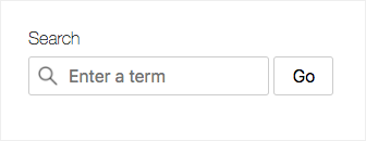
<label class="form-search">
	<span class="label-text">Search</span>
	<input class="form-control" type="search" placeholder="Enter a term">
</label>
<button class="form-control">Go</button>
Using a search icon and placeholder attribute (hint: “Enter a term”) makes the visible label somewhat redundant, so we can safely hide it from view with our a11y-only class to shrink the footprint:
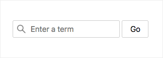
<label class="form-search">
	<span class="label-text a11y-only">Search</span>
	<input class="form-control" type="search" placeholder="Enter a term">
</label>
<button class="form-control">Go</button>
Visible and accessibly hidden labels are read the same way by screen readers. In both cases you’ll hear:
- NVDA: Search, Enter a term, edit, blank
- VO Mac: Search, edit text, Enter a term
- VO iOS: Search, Enter a term, search field, double tap to edit
Aside: By default, NVDA will speak “autocomplete” when identifying the field unless it’s explicitly turned off. Use the autocomplete attribute to control this feature.
Consolidate labels into a single heading
Permalink to 'Consolidate labels into a single heading'Sometimes we’ll use 2-3 fields to collect a set of related data, in which case visible label text isn’t necessary for each individual field. Instead we can use a single heading for the set and accessibly hide individual labels from view, just like we did in the previous example. The container markup we use to group these fields can also convey meaning to screen readers.
When you use fieldset and legend, NVDA and VoiceOver (iOS only) read the legend before the first field’s label. So the following markup:
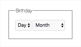
<fieldset>
<legend>Birthday</legend>
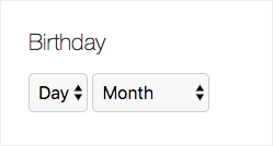
<label><span class="a11y-only">Day</span>
<select class="form-control">
<option disabled selected>Day</option>
<option>1</option>
...
<option>31</option>
</select>
</label>
<label><span class="a11y-only">Month</span>
<select class="form-control">
<option aria-hidden="true" aria-role="presentation">Month</option>
<option>January</option>
...
<option>December</option>
</select>
</label>
</fieldset>
Is read aloud as:
- NVDA: Birthday grouping; Day, combobox, [value], collapsed
- VO iOS: Birthday, form start; Day, [value], popup button, double tap to activate the picker
(VoiceOver on Mac reads the legend as a typical text node.)
Alternately, you could use a div with a heading element to group related form elements, but there are pros and cons that you’d need to weigh against your goals. With a div + heading you’d lose the bonus “grouping” and “form start” language that screen readers speak when they encounter a fieldset + legend, but when you consider that most screen reader users rely on headings for navigation, using a div + heading may be more helpful structural markup for a multi-part form.
Conclusion: label everything
Permalink to 'Conclusion: label everything'
Out of the box, the label element is all we need to indentify fields in an accessible way. Used in combination with accessible hiding and other helper elements, like placeholder or icons, we can ensure that a form element’s purpose is clearly communicated to all users.
The code that I tested is available on this demo page, and I’ve included markup variations so you can see and hear for yourself how they differ across browsers and screen readers. And if you missed the first post in this (very informal) series, check out Accessible Links Re:visited.
Want to chat about this post? Find us at @filamentgroup on Twitter.