Bulletproof Accessible Icon Fonts
April 2020 note: Hi! Just a quick note to say that this post is pretty old, and might contain outdated advice or links. We're keeping it online, but recommend that you check newer posts to see if there's a better approach.
Care must be taken when implementing icon fonts to ensure a great experience for all users. What happens when your font doesn’t load? What happens when @font-face isn’t supported in the browser? We’ll show you how to implement bulletproof font icons.
In our never-ending quest to build sites more efficiently and effectively for our clients, the lowly font has been proposed many times as an option to easily implement vector icons. While we typically prefer (and recommend) using SVG for vector icons for some of the reasons Ian Feather of Lonelyplanet.com has documented in his blog post, we sometimes collaborate with other teams who have already implemented icon fonts. For those cases we decided to research how to best implement icon fonts in a universally accessible way.
Did you know that most methods for including icon fonts don’t accommodate screenreaders very well, and require some specific markup patterns to work well and be accessible? And we discovered that a number of both old (and new!) mobile browsers—specifically Opera Mini, the Nokia XPress Browser, Blackberry 4–5, Android 2.1, and Windows Phone 7–7.8— do not support @font-face at all. With little bit of research, we were surprised to learn that (at time of writing) these browsers serve at least 370 Million users worldwide.
In this article, we’ll discuss the lessons we learned about where font icons do and don’t work well, what happens to font icons when @font-face is not supported (or when the font doesn’t load), and how to address those issues in our quest for a bulletproof method of delivering font icons.
Issues with Font Icons
Permalink to 'Issues with Font Icons'Accessibility
Permalink to 'Accessibility'Consider the following markup:
<span class="icon-star">Favorite</span>
Many popular icon font libraries use the above markup and inject an icon using CSS :before or :after. However, this content is not hidden from screen readers and may be read aloud. “But it’s Unicode!” you say, “Do screen readers even bother with Unicode characters?” Yes, they do (even some characters in the Private Use Areas, but more on that later).
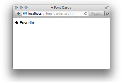
For example, if we apply the following CSS to our span example:
.icon-star:before { content: "★ "; }
the resulting page will appear like this in most browsers, which looks great:
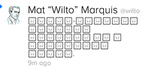
But VoiceOver (on Mac OS X) will verbalize this as “Black Star Favorite.” Not ideal.
Unfortunately, there’s no reliable CSS-only approach to hide superfluous visual content from screen readers (support for speak: none is limited). The most reliable way to hide superfluous visual content from a screen reader (but not from a sighted user) is to use aria-hidden="true". This approach requires us to use a separate HTML element for our icons, which rules out the use of :before or :after on a parent element.
This leaves us with the following HTML and CSS pattern:
<style>
  .icon-star:before { content: "★ "; }
</style>

<span><span class="icon-star" aria-hidden="true"></span>Favorite</span>
VoiceOver reads this as “Favorite” and the visual styling we want is preserved.
Side note: There are known open issues with Chrome and Firefox on aria-hidden content inside of a <button>element, but even in these cases aria-hidden remains the best approach to hide content from screen readers.
Responsible Fallbacks
Permalink to 'Responsible Fallbacks'Next let’s consider what happens when the browser doesn’t support @font-face and/or the font file doesn’t load.
Two common methods for implementing custom icons as icon fonts include mapping said icons to Unicode characters and mapping to specific character-string ligatures. Our testing showed that both methods have their challenges.
Implement Unicode; Fallback to Emoji or Whitespace
Permalink to 'Implement Unicode; Fallback to Emoji or Whitespace'In Unicode there are three free-for-all sections that are not defined by the specification. Called Private Use Areas (or “PUA”), these areas allow custom fonts to insert glyphs that have no official Unicode meaning. Use of the first PUA (sometimes referred to as the “BMP PUA”) is acceptable with a UTF-8 encoding.
Many popular font icon solutions map their own characters to the PUA range in order to avoid conflicts with existing Unicode definitions. For example, you wouldn’t want to override the Unicode definition for Black Star to a Rainbow. (Well, maybe you want to, but you shouldn’t.)
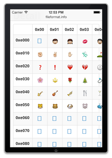
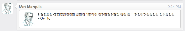
Using the PUA avoids semantic conflicts, but that still leaves us with visual ones. For example, some operating system default fonts define their own characters in the PUA. If any of your icons are mapped to a character with a default glyph and the font request doesn’t successfully complete, the default glyph will be shown. Here’s a small sample of the PUA on iOS7:
Consider our previous example. Let’s assume we map a new custom black star icon to a character in the Unicode PUA. The markup would look something like this:
<style>
  .icon-star:before { content: "\e001"; }
</style>

<span><span class="icon-star" aria-hidden="true"></span>Favorite</span>
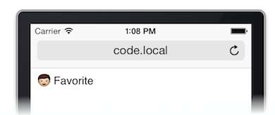
When the font icon request fails, the default Unicode character displays instead, on iOS this is shown:
When a conflicting PUA character isn’t explicitly defined, it doesn’t mean we can expect a blank character—instead, a default character for a missing glyph may be shown.
Often this is as simple as a rectangle (the dreaded Default Rectangle Glyph):
And in some cases, it can be more obtuse:
Icon font solutions often rely on the Flash of Invisible Text, or FOIT, (read more about WebKit’s alternative to the Flash of Unstyled Text, or FOUT) to hide these fallbacks while the @font-face request is in flight. The FOIT is a point of contention among web developers. In the unlikely event that browser switch to use a FOUT instead of a FOIT in the future, icon fonts will need additional protection to hide fallback glyphs while @font-face requests are in progress.
Implement Ligatures; Fallback to Real Text™
Permalink to 'Implement Ligatures; Fallback to Real Text™'Instead of relying on specific characters for fallback, someone had the great idea to use ligatures for fallback text. A ligature “occurs when two or more letters are joined together to make a single glyph.” This lets you substitute glyphs when predefined character sequences are entered in the source text.
For example, a ligature can substitute a ♥ when you type “love”:
When ligatures are not supported (or the font doesn’t load), the fallback text is shown.
This sounds great in theory, but there are a few limitations.
For a while, many resources recommended using text-rendering: optimizeLegibility; to opt-in to ligatures, which is actually part of the SVG specification (not a CSS standard). This solution is really buggy.
Some proposed an alternate method to enable ligatures: font-feature-settings. While more reliable, unfortunately, support for this approach is not great even on desktop browsers: custom font icons were notably missing on IE9 and below, Android 4.3 and below, anything prior to BlackBerry 10, and the current versions of IE Mobile. As of time of writing, this means the fallback experience would be served to 30% of global users. (Ouch.)
Another concern with ligatures is that you’re tying content with visual presentation. This can cause problems with internationalization; e.g., any text would need a separate ligature for each language, which introduces interesting maintenance and workflow problems. It would also be interesting to measure the font size differences for a font with a single language versus ten different languages. Would it be sufficient to warrant creating separate fonts for each language? Probably not—even though it’s additional bytes downloaded and not used.
Finally, it’s also worth noting that ligatures cannot contain whitespace, which rules out multiple words for a single icon. (Larry Fox was kind enough to point out that ligatures can support whitespace, although Keyamoon points out that there is an open bug with whitespace ligatures in Chrome.)
So, what now? Are icon fonts a lost cause?
Permalink to 'So, what now? Are icon fonts a lost cause?'Actually, no. Despite the hazards noted above, we can still use icon fonts! We just have to take a little bit more care than just plopping a @font-face block into the CSS and calling it a day.
Before we get into the finer detail, we’ve devised two different solutions based on two Font Icon Use Cases:
- Decorative Icons: these are cases where the icon is purely ornamental and doesn’t incorporate core meaning or functionality. If the icon glyph does not show, that’s ok, but the fallback experience must not take up any screen real estate for proper centering/alignment of neighboring content.
- Critical Icons: in these cases, the icon is critical to either the sense or the function of the site, and either an icon glyph must be shown or some fallback content must be shown in its stead. There are two variants of Critical Icons: Fallback to text (of varying length, no real estate restrictions) and Fallback to another glyph, either a reliable Unicode equivalent (NOTE: very few reliable cross-platform/browser glyphs exist, luckily John Holt Ripley has put together a support matrix for Unicode characters) or an image (probably a bitmap PNG for compatibility).
To shortcut the complexity of this implementation, we distilled down the CSS and JS we used for these examples into a reusable library called A Font Garde. We’ve provided this library on GitHub so that you can easily implement these patterns for bulletproof icon fonts in your own work. Include the two individual Modernizr feature tests, afontgarde.css, and afontgrade.js and you’re off to the races.
Decorative Icons
Permalink to 'Decorative Icons'Decorative Icons are the easiest use case to implement. The implementation simply displays the icon in cases where @font-face is supported, and hides it when it’s not.
The A-Grade experience would look like this:
And C-Grade browsers would display this:
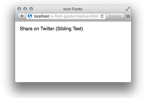
It requires only a few markup pattern requirements to implement:
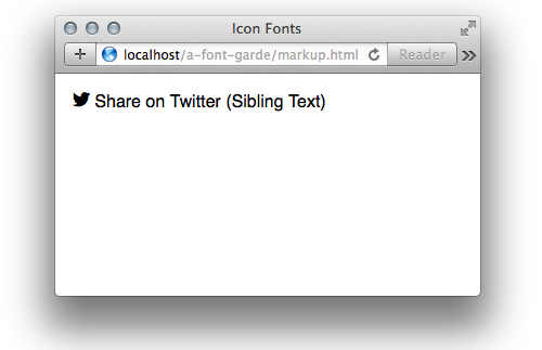
HTML
Permalink to 'HTML'<span class="icon icon-twitter" aria-hidden="true"></span>
Share on Twitter (Sibling Text)
First we use a separate span element to solve the accessibility issues with screen readers. After our standard @font-face block, we’ll add our CSS for the font icons:
CSS
Permalink to 'CSS'.supports-fontface.icomoon .icon:before {
font-family: icomoon;
}
.supports-fontface.icomoon .icon-twitter:before {
content: "\e604";
}
Notice that we’re using a Modernizr feature test to supply the supports-fontface class. The icomoon class is supplied by afontgarde.js (which tests to make sure the font has successfully loaded by measuring and comparing glyph dimensions against a default font).
JS
Permalink to 'JS'AFontGarde( 'icomoon', '\uE600\uE601\uE602\uE605' );
Here, we pass in the font-family and a few of the icon glyphs to the utility for measurement. You only need to call this utility once per font and we’ll rely on the icomoon class for later examples as well.
Since the CSS requires these two classes to be added for the Font Icon to display, it solves the issues noted above. Great! This use case is good to go.
Critical Icons
Permalink to 'Critical Icons'For critical icons, we want to ensure that something appears if the icon font fails. These cases generally fall into one of two camps: cases where we want to substitute text for the glyph image, and cases where we use an alternate glyph.
Critical Icons with Text Fallback
Permalink to 'Critical Icons with Text Fallback'A-Grade
Permalink to 'A-Grade'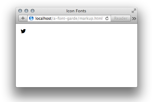
C-Grade
Permalink to 'C-Grade'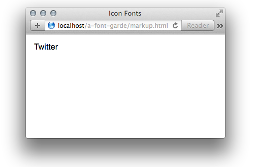
HTML
Permalink to 'HTML'<span class="icon-fallback-text">
<span class="icon icon-twitter" aria-hidden="true"></span>
<span class="text">Twitter</span>
</span>
CSS
Permalink to 'CSS' .icon-fallback-text .icon {
display: none;
}
.supports-fontface.supports-generatedcontent.icomoon .icon-fallback-text .icon {
display: inline-block;
}
.supports-fontface.supports-generatedcontent.icomoon .icon-fallback-text .text {
/* a generic way to visually hide content while remaining accessible to screen readers (h5bp.com) */
clip: rect(0 0 0 0);
overflow: hidden;
position: absolute;
height: 1px;
width: 1px;
}
The above is library code, included with afontgarde.css
The same feature test principle applies here, except we add an additional supports-generatedcontent class to make sure that :before and :after are supported. If not, fallback text is shown.
Critical Icons with Glyph or Image Fallback
Permalink to 'Critical Icons with Glyph or Image Fallback'A-Grade
Permalink to 'A-Grade'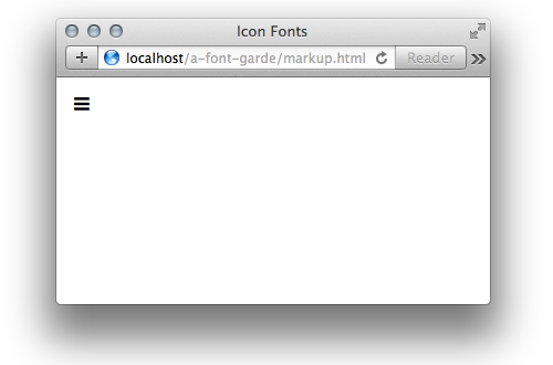
C-Grade Glyph Fallback
Permalink to 'C-Grade Glyph Fallback'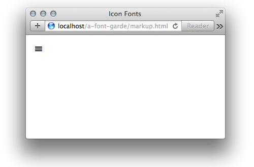
C-Grade Image Fallback
Permalink to 'C-Grade Image Fallback'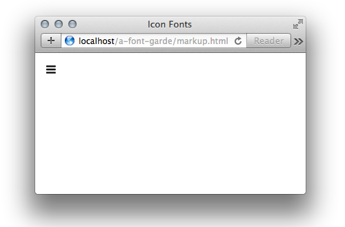
HTML
Permalink to 'HTML'<span class="icon-fallback-glyph"><!— or "icon-fallback-img" —>
<span class="icon icon-hamburger" aria-hidden="true"></span>
<span class="text">Menu</span>
</span>
CSS
Permalink to 'CSS'For brevity, library code from afontgarde.css has been omitted.
  /***************************
   * Fallback Glyph
   ***************************/
  .icon-fallback-glyph .icon-hamburger:before {
    content: "\2261"; /* Hamburger */
    font-size: 2em;
    line-height: .5;
  }
  /* A-Grade */
  .supports-fontface.icomoon .icon-fallback-glyph .icon-hamburger:before {
    content: "\e601";
  }
Make sure that you choose your fallback glyph character with care. Cross-browser/platform compatibility may vary. Check John Holt Ripley’s compatibility tables.
Also note that we adjust the font-size and line-height of the fallback glyph to match the Font Icon as closely as possible. When (and only when) the font has loaded, we set the CSS content to the new Font Icon glyph.
  /***************************
   * Fallback Bitmap
   ***************************/
  .icon-fallback-img .icon-hamburger {
    width: 1em;
    height: 1em;
    background: url("fonts/png/hamburger.png") no-repeat;
  }
  /* A-Grade */
  .supports-fontface .icon-fallback-img .icon-hamburger:before {
    font-family: icomoon;
    content: "\e601";
  }
Due to race conditions with the feature test and CSS background-images, the fallback image use case is less reliable than other approaches. If the script waits for the font load check to execute (and add the icomoon class), the background-image request will be prematurely triggered despite the font loading successfully. The other half of this compromise means that if the HTTP request for the font fails, we show a default Unicode character.
Note that we adjust the width and height of the fallback image element to match the Font Icon as closely as possible. If you want to adjust the size of the background-image, take note the limitations with the browser support of CSS background-size.
Whew!
Permalink to 'Whew!'This probably feels like a lot. But that’s why we’ve packaged it up in an easy-to-include library that allows you to reuse these patterns with little overhead. Feature tests are the key with icon fonts, make sure you use them wisely to safeguard your content from unintentional fallback experiences.
Have feedback? Hit us up on Twitter @filamentgroup.