Delivering Responsibly
At several conferences throughout the past year, I’ve presented a talk called Delivering Responsibly with slight variations and updates each time. The following is a transcript and slides from the last time I gave the presentation, at Fronteers Conference in Amsterdam, October 2015.
Today I’m going to talk about delivering fast, resilient, accessible sites. I’ll cover some challenges we face in doing that, and some practices and upcoming standards that we can use to make sites usable on any device as soon as possible.

As web designers and developers, we all have our own specialties and responsibilities, but broadly speaking, collectively, we might say it is our job is to deliver sites that respond to our users’ needs.

Sounds simple enough.
But if you’ve built sites that work across many devices before you know that it’s anything but simple. It’s been shown that our users’ requests are largely the same regardless of their browsing situation, but the way we respond to each user’s requests can and should vary dramatically. That’s because there’s incredible diversity in the means by which people access our sites.

Ultimately, we want to deliver services that feel at home and appropriate on any given device. And on the web today, our sites need to respond appropriately to an increasing number of factors.

It’s been said that the web is a hostile medium to work with. I think it’s especially hostile to assumptions–assumptions that users, browsers or networks are certain to behave in a particular way, or have certain characteristics.
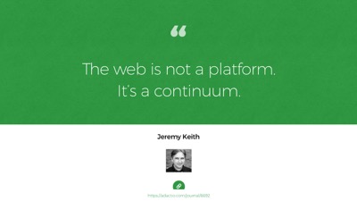
That’s because the web isn’t any one platform, but more of a continuum, to quote Jeremy Keith. A continuum of features and constraints.
Or, if that sounds overly tidy, you might say it’s more of a scatterplot.
There’s so much to consider. Let’s talk about some of those features and constraints.

Perhaps most obviously, our interfaces need to respond appropriately to a device’s viewport size. And there’s an incredible array of viewport sizes to consider today.

Across devices, viewport sizes have reached a nearly continuous gradient from watches to phones to e-readers to tablets to laptops to monitors to tvs, and more. Many devices offer two orientations as well. Some can browse in split screen. It’s almost silly to focus on any particular viewport size anymore because they can be almost anything.
This calls for designing fluid user interfaces, rather than toggling between a set of fixed-sized designs, and responsive design allows us to do just that.

But there’s a lot more. Along with viewport size differences, we need to pair the fidelity of our interfaces with that which can be expected of a particular device’s capabilities.
This means qualifying the application of CSS and JS to ensure UI enhancements apply safely, to avoid breaking an already usable experience.

Feature support differences happen for all kinds of reasons, not just by accident and not just in older browsers.
For example, millions of people use proxy browsers like Opera Mini. It’s a great browser, especially if you have a simpler phone or want to be conscious of your data usage.
“Mini” proxies everything you request to compress it and make it transfer quickly and cheaply. It also probably breaks your JavaScript, and doesn’t support some commonly-used workarounds, like icon fonts.

“Mini” is just one example of how feature support can vary, but subtler feature variations occur across all browsers and devices.
Input and output mechanisms vary too. Most devices offer multiple means of interacting with sites, between hardware buttons and software gestures, mouse, keyboard, and assistive technology.
We must be careful not to assume that any one of those modes will be exclusively in play. Factors like screen size and say, support for touch interaction do not always correlate anymore.

Those were some device and UI-related conditions to consider. But mobile devices brought other constraints to the web too, like widely varying network behavior.

According to Ericsson’s Mobility Report in 2013, just 2 years ago, 60% of the world’s connections were sub-3G.
To be clear, that’s 2G–“Edge”–as the majority network speed worldwide.

And today, that 2G and 3G majority is still very much here.
This is from Ericsson’s 2015 report. Focus on the green areas: that’s 4G coverage. The US leads in 4G support at 40%, but it still has more users on 3G and slower. Western Europe is still 60% 3G, with only 15% 4G.

Ericcson’s projections for 2020 are encouraging… that is, if you only aim to reach folks in the US and Western Europe.
Those green bars are going to take a while to fill in.

So great network speed isn’t evenly distributed yet. But speed isn’t our only network concern.
Network reliability and consistency have huge impacts on how we deliver sites, as HTTP requests come with no delivery guarantee. They can and do drop, hang, or time out.
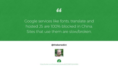
Requests can be blocked deliberately too, like in China where all of Google’s services are blocked.
Google fonts, their JavaScript library CDNS… all blocked in China. So sites that depend on those services working for them may not work at all there.

Beyond that, even on a reliable and unimpeded connection, requests can fail for other, more personalized reasons.
We often say that Progressive Enhancement is not about people who disable their javascript (because who would do that, right?).
Well, we might want to relax that position a bit. Recently, we’re seeing new and very mainstream ways that many browser features can be blocked or disabled. The most popular Ad blockers often block commonly used CDNs by default, like the ones we use to host our CSS and JavaScript. So our enhancements may or may not reach our users.

Content Blockers, which are new to iOS9, allow users to block types of assets
This screencap is from one of the most popular apps in the app store today, Purify. The entire app is just a panel that offers a few major features to disable to speed up the Safari browser, like custom fonts, JavaScript, trackers, ads, images. Maybe disabling JavaScript or custom fonts is already a lot more common than we think.
Also, content blockers can block javascript requests, but they don’t disable JavaScript. So noscript fallbacks won’t help in this case – requests simply fail.
There are other side effects to consider here. People have come to learn that web fonts take a long time to load. Boom! Just disable them. And along with custom fonts, there go the icon fonts too, so we need to be thinking about fallback images and text for font icons. Or better yet, use SVG instead.
Most importantly, if disabling enhancements like JavaScript or ads ends up breaking your site, will people just assume that your site is down? I suspect they will. I would.
And really who would blame people for reacting to the web this way? Our own practices have set the stage for blockers to become enormously popular.
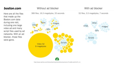
The NYTimes recently did a story and found more than 50% of all mobile data comes from ads.
…they also ran a story on iOS content blockers and how they can help speed up your browser, so you can bet that real people are using them (not just web developers).

So these factors collectively form a pretty hostile medium. But it’s important to note that these are not just factors that make our jobs harder. Considering these factors IS our job. Our job is to use the strengths of our medium to reach people and respond to their needs.
And I think reach is the greatest advantage of web technology. If we do our jobs well, our sites can reach folks who access the web under very different circumstances than many of we web designers do day to day.

…and that’s inspiring I think. But I find that despite that we have this distinct advantage in using web technology–that it can have enormous reach–it’s common to encounter sites that are built in ways that inhibit their reach… that aren’t resilient.
Sometimes that’s due to assumptions we web developers make about our users, or conveniences we desire in our workflow.

Some of our most popular web frameworks are built on very risky assumptions. Imagine a house purposefully built so that you could not enter it if the power goes out. Even if all you need is shelter.
That sounds crazy, but that’s exactly how a lot of web apps base their reliance on JavaScript loading and running. A site’s content & basic function is often reasonable to offer without using any JavaScript at all, yet we sometimes choose to make our apps entirely reliant on the web’s most fragile layer.

It’s easy for us to forget about that fragility.
As developers and designers, many of us work in relatively ideal conditions. To work efficiently, we need fast, reliable networks to stream enormous amounts of data, and we need to have access to the latest, most capable internet-accessing devices in existence.
So it’s easy to forget that we’re often an edge case amongst our own users, and potential users.
And when we forget, very real costs are transferred on.
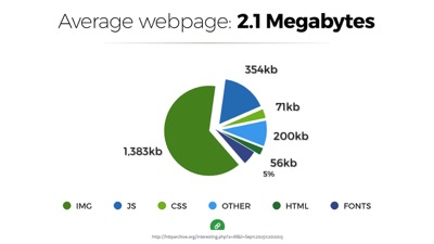
Today the average webpage weighs over 2mb. I’ve had this chart in my slide decks now for 3 years. In 2012 the number was just over 1mb, and we were upset about it then too.
This figure came from the top 10,000 sites on the web, but it may even be optimistic. Many popular sites today are heavier than 2mb. And that’s a real problem because most devices today access the web over data plans that have monthly or prepaid caps
There’s a real cost to every byte we download.

Tim Kadlec recently built What Does My Site Cost .com. It’s a website that calculates the real cost of accessing any site on the web using the costs of the cheapest data plans around the world.
For example, an article on the Wired site weighs over 11.27 mb. For some people it costs almost $4 US dollars to visit that page! For many it’s at least a dollar.
So page weight does matter. Access can be slow, expensive and prohibitive.

And besides, building sites that only work for the luckiest, most fortunate users on the web is not just bad for business, it’s also a pretty boring use of our technology. The most interesting challege of the web is the building something that can reach and connect more people than any other technology can dream of reaching.
So rather than designing for the best case scenario, we need to design for reality, because our users live in the real world. But how do we, the privileged web developers, know what it’s really like out there?!
Tools! We have it so good, we need to use tools that simulate what the real world is like for our users. Here are a few of my favorites.
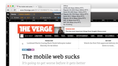
First, there are network and device emulation tools built right into our browsers’ devtools. This is Chrome devtools with the device panel open to select a network throttling speed. All of the browser’s requests go through that throttle when it’s in play, so you can test how things look on a 3G connection, for example. Again, the most popular speed in the world.

If you want to throttle network speeds in other browsers, we have options there too. This is a Mac preference pane called Network Link Conditioner, which you can get from the app store.
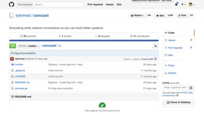
There’s also this other network throttling tool, which was apparently named by an elite-level troll.
“Comcast” is a tool that simulates, uh, not good connections–like those you might experience if you get your internet through Comcast in the US. Everyone loves to hate Comcast apparently.

Another way we can simulate real life conditions is by testing with extensions and blockers.
Put yourself in your users’ shoes. Disable things. Disable JavaScript, disable fonts. Try to break your site, then fix it! Think of your site as a tool that needs to work in adverse conditions, because this is how your site is actually going to be used.

On the browser & device testing side of things, we have tools like Browserstack. Browserstack has live device testing–not just static screenshots–and often you’re using real devices on BrowserStack, not just emulators (which are helpful as well).

Of course, nothing replaces testing a real device in your own hands. For performance, animations, touch gestures, don’t trust an emulator or virtual service alone. Get yourself some devices.
I’d recommend searching Amazon to find out what’s most new and popular–test on those. Some of the most popular phones on Amazon are very basic smartphones with pretty rudimentary rendering.
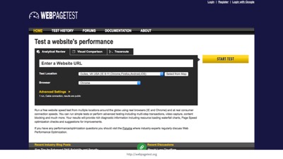
Lastly, the tool I’d recommend most is webpagetest.org. It’s a website. You can enter a URL, choose a browser/device combination to test, and a region of the world to run the test from, and webpagetest will load your page from there and give you all sorts of information about how it loaded. It’s my favorite tool for development and testing.

Simulating the real world is critical. We need to consider functional, manual testing to be a major portion of our development cycle. It’s not just something to throw over to QA when we’re done. Use these tools as you develop to make things bulletproof.
I find that sometimes, writing the code takes less time than testing it and hardening it. That’s probably just something to expect.

So I’ve identified some of the factors we need to consider, and ways we can produce less-than ideal conditions at home. To thrive in a hostile, unpredictable, undependable environment, we need to build for resilience.
Right now may the most exciting and challenging time in the web’s history to be building fault-tolerant, resilient sites. So for the remainder of this talk, I’m going to focus on delivery, because delivering and responding quickly is the first step to a broadly accessible site.

From a technical perspective, right now is a very unique time to be building on the web. We’re at a bit of a technological crossroads.
On the one hand, we’ve spent years developing tools and practices that have just begun to prove their potential. We’ve found ways to work around weaknesses in the delivery pipeline.
On the other, we have some major infrastructure changes that are just now happening on the web, and those changes make some of our best practices no longer necessary.

One new infrastructure change is http/2. Http/2 is not a breaking change, but rather a feature that capable browsers can opt into utilizing. So maybe better metaphor than a crossroads would be an on-ramp, or an escalator.
We’ve been running up against barriers in http/1 for a long time now, and we’ve developed some great ways to work within its constraints. In an http/2 world, those workarounds will still work fine, but many won’t be necessary anymore, and won’t be ideal.
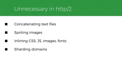
Http2 negates the need for a lot of things. Like common workarounds that reduce http requests: image sprites, concatenating text files, and inlining.
We’ve also done things like hosting our files across many domains to work around limits in the number of active requests we can have on any one domain. And those limits are no longer there anymore in http/2, so we won’t need to do that anymore.
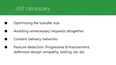
Of course, a great deal of our existing best practices won’t change at all. We still want to transfer as little data as possible to the user. We still want to avoid making unnecessary requests in the first place. We still want CDNs with servers close to our users for faster file transfers. And we still need to worry about network stability and feature diversity across platforms. These problems don’t go away in an http/2 world.
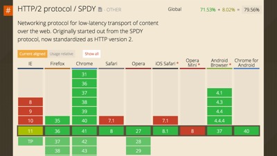
Also, like most things on the web, http/2 won’t work in all browsers. IE versions prior to 11 will never have http/2 support, nor will older versions of iOS or Android, and opera mini has no support yet either.
But! look at this support already, it’s amazing! Browser support is actually farther ahead than server support for http/2 (most server-side platforms have at least some http/2 features covered now), but both sides are quickly shaping up.
We should be factoring http/2 into our workflow today, or at least into our long-term planning.

We need to prioritize practices that will work today and tomorrow. One such practice is optimizing file size. There are easy and well-known ways we can reduce the weight of our pages and assets.

To start, we should be optimizing our files so that they’re lighter for network travel. We should make sure our images and fonts are small as can be. We should remove unmeaningful whitespace in text files: css, javascript, even HTML can be minified. And of course, we should compress for transfer with GZIP.

In addition to merely optimizing images, it often makes sense to offer different versions of an image based on browser conditions like viewport size, screen resolution, or even network speed. And our community has worked very hard to develop new standards that make this easy for us to manage.
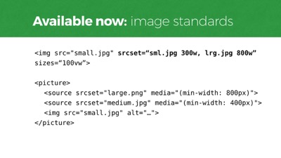
Srcset and Picture are new web standards. They’re at least partially supported in most browsers now. Both have nice fallbacks built-in.
We also have new features that are exposed to the server in each request the browser makes.
Client Hints are a new type of headers we can opt-into sending with requests for things like images, and they let the server decide how best to respond, which means we can alleviate our markup from defining all the potential resources it might need to request.
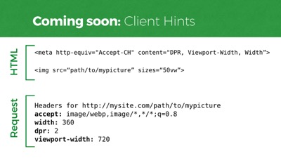
Here’s how they work. In the markup, we create a meta tag with a few Client Hints to send. Device pixel ratio, viewport width, and rendered asset width (as defined in sizes). And you can see the headers that the server will receive. The server can use this information to return whatever it wants for “mypicture,” meaning your HTML file can have less configuration info. This is a standard that will work in Chrome 46 and Opera, for starters.

So making our delivery payload smaller helps a lot. Data costs money, and smaller amounts of data transfers faster as well.
But beyond file sizes, we also need to think about streamlining our path to rendering the page so it spins up as quickly as possible. And that’s where file size is less of a concern than how we prioritize our asset loading pipeline.
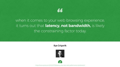
A lot of people think of bandwidth as the big speed bottleneck on the web. But in 2012, Ilya Grigorik wrote that it turns out that the web’s performance problems have more to do with latency than bandwidth. What Ilya’s referring to is the physical distance our code needs to travel between the server and the browser. A trip to the server and back takes measurable time. Sometimes a lot of time.

Our code is hurtling around the world over fiber wire. And even at nearly the speed of light, that distance takes time.
This is why CDNs matter. After optimizing size, you still have to factor in proximity delays. Round trips to the server can be hundreds of milliseconds at best, but often over a second.
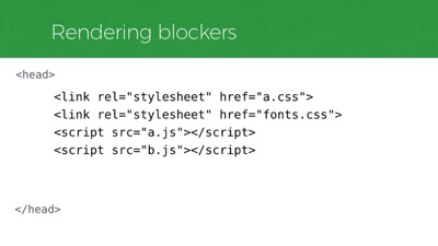
What’s worse is that we often require many round trips just to start rendering a page. That’s because when a web page is requested, the first thing that is sent back to the browser is the HTML. If that HTML references external files that are required for rendering the layout, then the browser goes back to the server and fetches them, and we’ve made several round trips.

So we want to minimize the round trips that occur in our critical rendering path. One way to avoid making many round trips is to carry more with you on each trip. Sort of like carrying groceries from the car. Anyone else done this before?
For a long time now, this is what we’ve had to do to make a website render fast: bring the important stuff back in the first trip from the server, get the rest later.

Now, to do that in a way that works with any browser, we need a small workaround. Google has this tool called PageSpeed Insights - it’s full of great tips.
This is one tip related to this workaround: “identify and inline the CSS necessary for rendering above the fold content. ” The idea is that we need to avoid making additional trips for anything we’ll need to render the top portion of the page… above the fold, so to speak.

Now, I know what you might be thinking. “The fold!” And on the web there is no one fold. It varies across viewport sizes. There’s no one consistent viewport height across browsers and devices.
But this doesn’t need to be controversial advice. Pages are viewed from top to bottom. Google’s telling us to prioritize the code necessary to render the top of the page before the rest of the page. Cool? Cool.
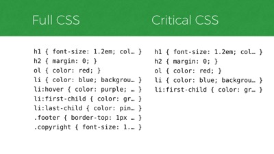
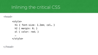
In CSS, that prioritized code might look something like this.
If you can imagine the CSS on the left reflecting a site’s full stylesheet, then on the right is a subset of that CSS that is deemed critical to a particular page on the site, necessary for styling the top portion of the page across all of its layout breakpoints. So the “critical” CSS is a subset of the full CSS
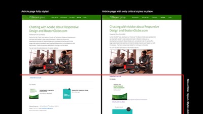
Visually, it looks like this. On the left is an article page on Filament Group’s site. On the right is that same article with only that page’s critical CSS styles applied. The red line designates the line above which we consider to be the page’s critical rendering region, which in this case is around 1200x900px–a fairly generous size to cover most viewport heights and layout breakpoints. And you can see in the right graphic that below the red line, the design falls away, so we know we’ve isolated the subset of CSS for styling the top region.
So how do we know which portion of our CSS styles are for the top of the page? Easy! Just open up your CSS file and copy the first 100 lines or so! That’s it.
I’m kidding. We have great tools that analyze a site’s stylesheet compared to each particular template on a site, to extract the portion of styles that are used in rendering the critical portion of the page. One of those is a tool called Critical CSS, and Grunt CriticalCSS, which is a command line utility that you can run to perform tasks that you commonly need in preparing for delivery.
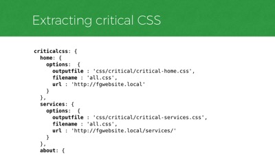
At Filament we run our critical CSS task on each unique template of a particular site and write each subset of styles to a separate file. As you can see in this configuration file for our critical CSS tool on a sample project, there’s a
criticalcsstask with subtasks for each unique template on a site. Each subtask references a representative live URL that uses a particular template, as well as the filename of the site’s full CSS file, and a file name to write the critical CSS styles to for that template.
Every time we make changes to our code, that task runs and we get a new batch of critical css files for the site.

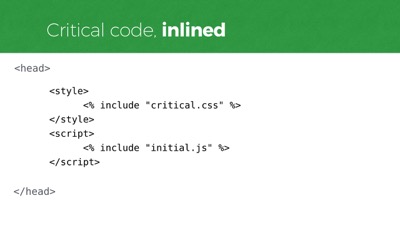
So that tool gives us a critical css file for each unique template. To avoid round trips, we are going to include the critical CSS right into the HTML, instead of referencing the CSS externally. This allows us to cram the important rules into that first round trip and render immediately upon arrival.
To include CSS inline in the page we have the
styleelement. Like this, right inside the head.
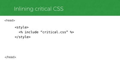
In a real project, you’d likely set this up to include each critical CSS file dynamically, either through a server side include or a build process. So that might look like this. Again, that’s including ONLY the critical CSS, not all of the CSS.
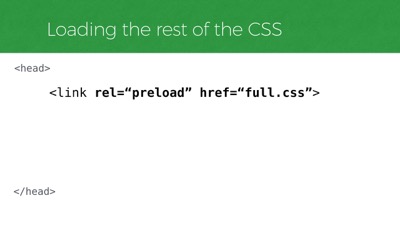
But we’ll also need to load our full stylesheet too, and without blocking rendering.
A regular old stylesheet link is not an option for this. Those stop rendering immediately, no matter where you put them in the DOM (at least in many browsers like Chrome, Webkits). A future-looking way we can now do this is to use a new standard called
link[rel=preload]. It’s not supported in any browsers yet but if we’re lucky maybe Jake will make it work in Chrome before I finish this talk.
Now,
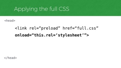
rel=preloadwill tell the browser to fetch that stylesheet, but it won’t apply the stylesheet once it loads. For that, we need to listen for itsonloadevent and set thelink’srelattribute to “stylesheet” instead of “preload”.
So in any browser that supports
rel=preload, this snippet alone will asynchronously fetch and apply a CSS file. But again, zero browsers supportrel=preloadright now, so that request will not be made. But it’s a nice way to reference our full stylesheet at least… maybe we could polyfill it for now.

And polyfills tend to use JavaScript! So let’s jump over to JavaScript and inline the critical portion of that as well.

Which brings me to the question, “what kind of JavaScript would be considered critical anyway?”
Well, ideally none of it. But having a little JavaScript running right away can help us deliver appropriately to newer browsers. Consider it “high-priority” JavaScript if you want–file loaders, feature tests, polyfills, and some logic to use those scripts to bootstrap your page. That sort of JS might belong in the
headof your page.
We don’t want to reference that JavaScript externally though. Like our critical CSS, we’ll want it to run immediately when the HTML is parsed, without delay. So we’ll inline it.
For Javascript inlining, we have the script element. We’ll use that to inline our critical JavaScript as well.
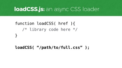
And for this example, my critical JavaScript will need to contain some file loading functions to load additional assets that aren’t as critical. One of those is a CSS loading function, which we can use to load our full CSS in a way that doesn’t block page rendering.
It’s called loadCSS. We can call that function and pass it a stylesheet url, and it’ll load and apply the stylesheet without blocking rendering, much like
rel=preloadwill work, but in a way that works in most any browser today.
Now that we have a CSS loading function, we can use it to polyfill that
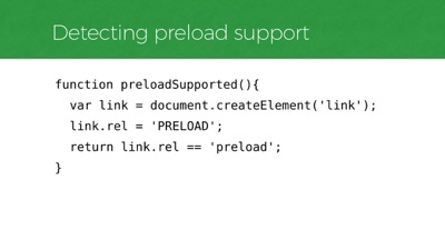
link[rel=preload]reference when necessary, to request our full stylesheet in any browser that doesn’t supportrel=preload.
To know whether a browser supports preload, we’ll need a feature test. This is one that Simon Peiters came up with in the w3c threads. The test will fail in any browser today because the feature is not yet supported. But the idea is that it’ll begin to pass once support is adopted, and our polyfill will deprecate itself automatically.
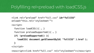
So we have those two functions, and now we can use them to polyfill that
rel=preloadtag.
That ends up looking something like this. If
rel=preloadisn’t supported, we’ll find thatlinkin the page and load the file it references using loadCSS. So that’s how we load our “non-critical”, full CSS - the site’s full stylesheet.

Moving on from CSS loading. I also typically include a JavaScript file loader, because I often have a lot more JavaScript to load than I want to inline in the head of the page. For example, a DOM framework and user interface improvements would be the sort of scripts to load later rather than inlining them in the head.
loadJS is a script we can use to do that, just like that loadCSS function we already used. Here, I’ve referenced my scripts as if they’re all packed into one file, “enhancements.js” for a single http request.
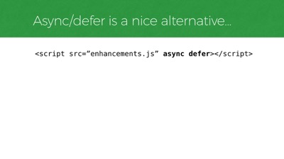
Of course, if you just want to load any old JavaScript file without blocking render, the standard async and defer attributes make that really easy too. And they’re supported most everywhere.
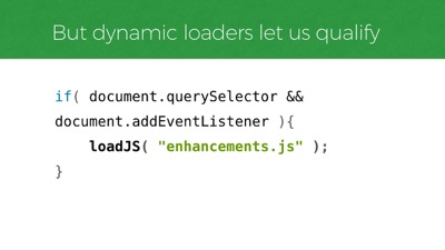
But! What’s nice about loading scripts dynamically is we can decide whether or not to load the file AT ALL, in real time. Here’s a basic example that does just that, using an approach known as Cutting the Mustard to check if a couple of baseline features are supported before requesting the script. We can use this technique to decide whether to load our JS at all based on features that we know our enhancement scripting will need in order to work.
So to bring all that together, let’s step back and look at the
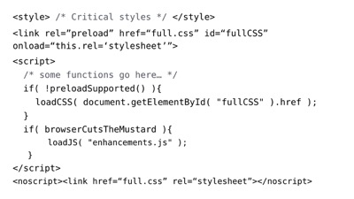
headof our page and our CSS and JavaScript loading approach. Here it is. Up top we reference our critical and full css, and after that, we polyfill the CSS loading if needed and load our full JavaScript manually, if qualified. Also at the end, anoscripttag wraps a regularlinkto our full stylesheet, just to make it a little more bulletproof in JS-disabled environments.
For what it’s worth, we also tend to set a cookie whenever a file has been loaded, and we use the presense of that cookie to decide whether to link to that file directly on subsequent page visits, which is nice because we only need to include inline CSS when the full CSS is not yet in cache.

So that process I just showed was dense, but I covered most of the considerations we think about for optimizing our critical rendering path.
Looking ahead, some of those steps may evolve a little bit with http/2 support in play. That’s because of one particularly neat feature called server push.

In http/2, network latency is still a problem, even though it makes better use of connections once you have them. Round trips to the server take time regardless of the protocol, which is why we inline things in http/1. Well, in http/2, inlining is not necessary anymore because of server push.
Server push lets us decide to push more than one asset back to the browser when we know it’ll need them to render a particular page. So… a request for a particular HTML page might return that page, and also critical.css, full.css, critical.js, and whatever else is relevant to rendering that page fast. All in the same request & connection!

What currently takes many round trips in http/1 can be done in 1 trip in http/2. So this feature negates the need for inlining CSS in our HTML. It negates the need for inlining anything, really. Well, for http/2-supporting browsers that is.
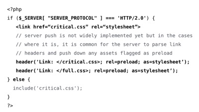
So what that might mean is, we will still want to extract the critical CSS for each template and drop it into a file (because we still want to request the smallest amount of CSS necessary up-front to render the page), but we won’t want to inline that file anymore for http/2-supporting browsers, since we can reference it with a normal stylesheet link and use server push to return it with the HTML.
And that’s a nice improvement because then the file is cached for future visits to templates that share the same critical CSS file.
But again, we will still want the benefits of faking server push in http/1 browsers, so some server negotiation will likely be best here: inline the css for http/1 browsers, or preload/push it in http/2.
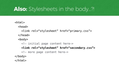
And on the topic of requesting that full CSS file, there’s another feature coming that’ll be an interesting alternative to consider for loading our full CSS. The Chrome team is considering changing how it requests stylesheets linked from the
bodyof the page so that it will only block rendering of content that comes after it that stylesheetlink.
Currently in Chrome (and webkit too), a stylesheet
linkanywhere in the dom will block all rendering immediately when its parsed–before anything is shown to the user. Soon though, this could allow a full.css or even a secondary.css to be linked just after the “fold” portion of your template (which would be a specific spot based on an assumed height). Jake Archibald has been pushing this approach and I think it’s really nice, particularly because it lets us request non-critical css with markup alone. It might even turn out that this feature would allow us to make many component-based CSS requests throughout the page, just before the markup that utilizes that CSS.
Chrome’s change would bring it in line with the behavior of several other browsers as well, so we could probably use it right away. The jury’s out on whether iOS and Safari will follow their lead, however, as they currently block all rendering for any stylesheet placement, just like Chrome. So this is a feature to keep on the radar for now.

So those are some considerations for moving CSS and JavaScript to non-blocking requests so we can show a page as soon as it arrives.
Yet! Despite having this workflow in place, a major blocker to perceived performance still comes from custom fonts. That’s because the default way many browsers load custom fonts right now is kind of awful. Many browsers, such as iOS Safari, hide the text of the page entirely while a custom font is loading - a behavior we often call the flash of invisible type.

Browsers like iOS Safari will hide the page content while custom fonts are loading for 30 seconds or more. For example, this is the Fast Co site when it loads. if you’re an iOS user this probably looks familiar because it happens a lot.

Recently we’ve been taking an approach to font loading that involves listening for when a font finishes loading, and then enabling it in our layout. To do that, we use a script called FontFaceObserver by Bram Stein. And we use it to add a class to the
htmlelement when the fonts are all ready, and we use that class to enable them in CSS, otherwise allowing a fallback font to show.
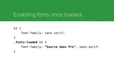
In CSS, that qualification is similar to the pattern you might recognize from Modernizr. First we style an element with a default system font, then we enable the custom font in a qualified way.
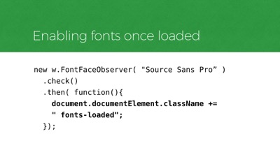
Here’s how the JavaScript looks for applying that class to qualify the CSS.
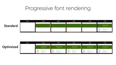
In this timeline of Filament Group’s homepage, you can see what this approach does. The text is visible as soon as possible, while the custom font loads at its convenience. And this works today in any browser.
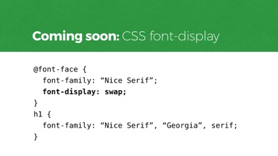
To pull of this sort of progressive font rendering in the future, we won’t need JavaScript listeners at all. The new CSS font-display specification covers several styles of prioritizing the way custom type renders. Here I’m showing the font-display property called “swap”, which will immediately render text in a fallback font and swap in the custom font when it loads. Other values allow you to hide text rendering for a duration, or even choose to only use a font if it’s already in cache from a previous visit (which may be preferable to most users, while hard to embrace as a designer).
So those are some techniques we can use to improve our delivery today and tomorrow. And if you’re interested, there’s an article on Filament’s site that shows just how much these practices can help.
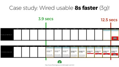
In the article I did a case study on that 11+ megabyte Wired.com Article shown earlier. And just by optimizing the rendering path alone, without changing the weight of the page at all, I was able to cut almost 9 seconds off the time it takes for that page to be usable on a 3G connection. From 12 seconds down to 4 or so. So it’s amazing how much impact these practices can have.

So, I know I’ve covered a lot in this talk. Indeed, I think we have a lot to think about.
But to close things out, I think we really need to remember that we can build beautiful, complex things that are broadly accessible. We have the tools today.
In truth, it’s often hard work to deliver responsibly–and resiliently–but it’s also our job.
Thanks everyone!