Image-free CSS Tooltip Pointers - A Use for Polygonal CSS?
April 2020 note: Hi! Just a quick note to say that this post is pretty old, and might contain outdated advice or links. We're keeping it online, but recommend that you check newer posts to see if there's a better approach.
A while back, Tantek Celik released A Study of Regular Polygons, which used a little-known CSS trick to create non-rectangular shapes such as triangles and pentagons with nothing more than an ordinary HTML element. The experiment is very interesting and really cool, but the practical takeaway wasn’t immediately clear.
Recently however, we’ve been working on building the markup for upcoming jQuery UI widgets, when we came across a case that prompted us to take another look at the technique. The tooltip widget design, fairly common in websites these days, uses a small triangular “speech bubble” pointer that is typically created quite easily with a background image. However, we wanted to maintain our commitment to keeping our jQuery UI widgets entirely themable, and using an image for that purpose wouldn’t fit with the flexibility jQuery UI requires. How to solve this problem without any need for images? That challenge led us to the experimental approach using polygonal CSS, shown below.
The Design Approach
Permalink to 'The Design Approach'The jQuery UI planning wiki page has several examples for the tooltips we intend to build into the library. For this article though, we’re just focusing the following simple tooltip design:
The challenge in executing this for jQuery UI is that we’ll need to pull it off without relying on images for the triangle shapes, because the jQuery UI CSS Framework enables markup to be entirely re-themable, using an infinite combination of backgrounds, borders, corner radius, and more. Using custom images for the pointer triangles would never match the flexibility and scalability of CSS alone. Since polygonal CSS can create non-rectangular shapes without images, perhaps it can provide the means to achieve our goal.
Polygonal CSS works by setting an element’s width to something small and then setting thick borders on less than 4 sides. To make a triangle shape, 2 of those borders have to have transparent color, essentially masking out the one visible border at an angle in attempt to connect corners.
The concept is easiest explained through a code sample. The following CSS will style a div into a red triangle:
div {
    width:0;
    height:0;
    border-left: 20px solid transparent;
    border-right: 20px solid transparent;
    border-top: 30px solid red;
    border-bottom: 0;
}
As demonstrated here:
Woohoo!
Making Use of the CSS
Permalink to 'Making Use of the CSS'Our tooltip will need two of these HTML triangles stacked on top of each other to acheive a container/border effect that matches the body of the tooltip. We’ve done this by using two div embedded div elements. The HTML for the entire tooltip looks like this:
<div class="fg-tooltip ui-widget ui-widget-content ui-corner-all">
    Tooltip content goes here...
    <div class="fg-tooltip-pointer-down ui-widget-content">
        <div class="fg-tooltip-pointer-down-inner"></div>
    </div>
</div>
As you can see, we’re using some classes from the jQuery UI CSS
Framework for the visual skin, but the important portions here are the
“fg-” classes: fg-tooltip-pointer-down and
fg-tooltip-pointer-down-inner. These two classes are used on the
speech bubble triangle portion of the tooltip and its child div element.
The following CSS will turn this markup into our tooltip design.
/*Tooltip and Pointer CSS*/
.fg-tooltip {
    padding: .8em;
    width: 12em;
    border-width: 2px !important;
    position: absolute;
}
.fg-tooltip .fg-tooltip-pointer-down, .fg-tooltip .fg-tooltip-pointer-down-inner {
    position: absolute;
    width:0;
    height:0;
    border-bottom-width: 0;
    background: none;
}
.fg-tooltip .fg-tooltip-pointer-down {
    border-left: 7px solid transparent;
    border-right: 7px solid transparent;
    border-top-width: 14px;
    bottom: -14px;
    right: auto;
    left: 50%;
    margin-left: -7px;
}
.fg-tooltip .fg-tooltip-pointer-down-inner {
    border-left: 5px solid transparent;
    border-right: 5px solid transparent;
    border-top: 10px solid #fff;
    bottom: auto;
    top: -14px;
    left: -5px;
}
A Demonstration
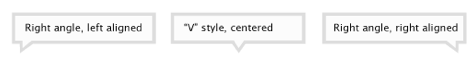
Permalink to 'A Demonstration'To demonstrate the full effect, we’ve built a demo page which simply shows and hides the tooltip element when you hover on the links below. We’ve also extended the CSS a little further to allow for 3 different triangle types, depending on which alignment you specify, to match our original design specs.
Abandoning images in favor of this approach allows a lot more
opportunities to customize the appearance with stylesheets, and we’ve
used the jQuery UI CSS Framework to demonstrate this flexibility. Each
tooltip below is styled using a different container class from the CSS
Framework (such as ui-widget-header and ui-state-error),
demonstrating the unobtrusive nature of this approach.
As you can see, the tooltips are entirely themeable with CSS alone, and the diagonals are even transparent, allowing text to show through behind them! They work in all browsers we were able to test - such as Internet Explorer, Safari, Firefox, Opera (almost), and Chrome.
Considerations
Permalink to 'Considerations'The only portion of this experiment that needed a little JavaScript tweaking was the inner triangle color. Since the border color of the inner triangle needs to match the background color of the tooltip content (to connect it visually), we had to add a little script to keep them matched up. This workaround would only really affect tooltips that require theme switching though (a requirement of jQuery UI widgets), so in a the average site you could just set a border color in the CSS and leave it alone.
We should also point out that these tooltips are not made to be production-ready and downloadable widgets, but just for demonstrating the result of the CSS. The technique described above could be used in any number of situations where connecting triangles are needed.
A minor downside of this technique is the fact that it uses a little extra markup for purely visual purposes. Fortunately, the additional markup is very lightweight and will most likely be added dynamically with javascript anyway. These sorts of workarounds are commonly found when CSS falls short of our needs, and you’ll need to consider their impact when using them in production environments.
So whattaya Think?
Permalink to 'So whattaya Think?'Crazy idea? Horrible misuse of HTML? Or a workable solution? We’d love to hear your thoughts! Let us know on twitter. Thanks for reading.