jQuery Custom File Upload Input: from the book Designing with Progressive Enhancement
April 2020 note: Hi! Just a quick note to say that this post is pretty old, and might contain outdated advice or links. We're keeping it online, but recommend that you check newer posts to see if there's a better approach.
As websites expand content-sharing and collaboration features, users are
electing to upload more and more files—photos, videos, documents, even
secure data—via web applications to store them in “cloud”-based systems
rather than locally on their computers. The HTML input element with a
type="file" attribute gives web developers a native control to handle
this file upload functionality. But browsers offer almost no control
over how file inputs are presented visually, making it difficult to
incorporate them into a uniform interface design.
Today, we’re releasing a jQuery file input plugin that uses progressive
enhancement to transform a standard HTML file input into a visually
customizable control. With a few lines of CSS and JavaScript, this
widget allows you to create a custom-styled file input that leverages
all of the accessibility features the native input provides.
This widget is one of the 12 fully-accessible, project-ready, progressive enhancement-driven widgets we created to accompany our book, Designing with Progressive Enhancement.
A quick demo
Permalink to 'A quick demo'Before we get into the mechanics of the custom-styled input control, here’s a demo that highlights key features. The input box and buttons have distinct, custom visual style; and when the user selects a file, the custom input updates to display the file name and an icon representing the file’s extension.
To ensure an accessible experience for the widest audience possible, this demo and all our widgets use our EnhanceJS framework, which tests browsers’ CSS and JavaScript capabilities and applies enhancements only to capable browsers. In practice, browsers that don’t pass receive a basic experience with the fully-functional native control; for capable browsers that do pass the test, the script applies advanced CSS and JS enhancements, adds a “View low-bandwidth version” link for users to toggle from a basic to enhanced view, and drops a cookie on change to record the user’s preference. EnhanceJS is used in the demo page, but it is not required to use the widget in your projects.
How does this widget actually work?
Permalink to 'How does this widget actually work?'The approach we’ve used piggybacks on top of the native file input:
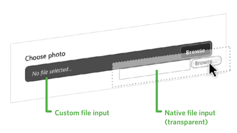
The widget creates a custom-styled file control using div and span
elements, and then uses JavaScript to set the native input’s opacity
to zero and dynamically position it invisibly between the cursor and the
custom control. The user actually interacts only with the native input
without knowing it. The following infographic demonstrates the concept:
In addition, the widget script applies custom styling, and parses the filename’s extension to recognize the file format so it can display a file-specific icon (the CSS includes a generic file icon and several specific icons—image, multimedia, zip folder—which are easily customizable).
The best part of this approach is that we get great accessibility
support for keyboard users and those with disabilities automatically.
Since we’re always using the native file input control, we can leverage
all the functionality and accessibility that it provides—the custom file
input is really a visual feedback mechanism only. And though the native
input is invisible, it’s still fully keyboard-accessible, so there’s
no need to add any additional accessibility features or ARIA attributes.
(We do, however, add one ARIA attribute to the custom widget to hide it
from screen readers, since it’s relevant only to sighted users.)
A tip of the hat
Permalink to 'A tip of the hat'This solution was inspired by the work of Michael McGrady and Shaun Inman, who developed this tricky bit of CSS and JavaScript to position the native file input under the user’s cursor to create custom file inputs. You can find that article here: Styling File Inputs with CSS and the DOM
How do I use it?
Permalink to 'How do I use it?'To use this script in your page, you’ll need to download and reference
both jQuery and jQuery.fileinput.js, as well as the associated CSS and
images for the control (download instructions are found below), and call
the customFileInput method on any list element on the page. For
example, to create a custom input control from a input element with an
id of file, find it using jQuery and call the customFileInput
method on it:
HTML:
<input type="file" name="file" id="file" />


JavaScript (jQuery):
$('#file').customFileInput();
Note: be sure to use jQuery’s $(document).ready event to wait
until the DOM is ready before running the script above.
Also, you can disable and enable the control by calling either
$('#file').trigger('disable'); or $('#file').trigger('enable'); on
the native input. Once disabled, the custom control will be styled to
appear disabled as well. If the input is disabled at load, the custom
control will naturally inherit that state, so you won’t need to call the
“disable” method when you first create the control.
That’s all there is to it!
If you’d like to learn more, we explain in detail how this widget works under the covers and how to apply these principles in different interactions or more complex scenarios in our book, Designing with Progressive Enhancement.