Move Fast & Don't Break Things
An annotated transcript of my 2019 conference talk.
Throughout the last year I presented an evolving talk about web performance called Move Fast & Don’t Break Things at several conferences, including Performance Now() Amsterdam, An Event Apart Seattle, Smashing Conf Toronto, An Event Apart Chicago, and Smashing Conf NYC.
Video of the talk is available from the Amsterdam, Toronto, and NYC shows. Below is an approximated transcript and slides from the presentation.

So there’s this old saying in our industry that bold, and successful web development is about Moving Fast & Breaking Things. It comes from a more naive time on the web, when people were advocating being a little wreckless in the name of innovation. These days, the sentiment isn’t as celebrated.
I guess when web developers find themselves testifying to congress about their practices… maybe it’s worth reevaluating the ethics that got us there. Maybe breaking things is… bad?
So I think we’re maturing and interested in not breaking things quite as much. But still, I find the relationship between moving fast and breaking things to be very relatable.

And that’s because regardless of whether it’s our stated goal, there are so many ways we can easily break access for our users. Especially when we’re “moving fast.” We want to move fast on developing new features without breaking things, and we also want to move fast and iterate while keeping our sites fast. I find those priorities are increasingly difficult to reconcile. Poor performance is one of the most common ways we break a good user experience today.
So I want to talk about what makes our sites break, and ways to make our websites fast, & keep them fast.

I’ll start with a little contextual history about breaking things. I’ve been building websites for a long time. Over the last 20 or so years I’ve been tinkering on the web, I’ve noticed that our notion of what it means to break things on the web has changed several times, and also that there’s been a common thread in the way we fix things, or even prevent them from from breaking in the first place.

Early on in web design, we focused heavily on normalizing features. Does anyone remember this site "Position is Everything? Great site. Totally useless today. Thank goodness! That’s because this site hosts a huge collection of very old Internet Explorer bugs and oddities, and even odder fixes. I think of it as like, caniuse dot com, crossed with a Ripleys Believe It or Not! museum. It’s amazing to think about the issues we used to deal with.

How about this site, Quirksmode? Full of its feature tables. This is still a great resource. If you’ve been making websites a while, you probably have used these sites a lot. In early versions of today’s browsers, not breaking things was difficult for different reasons than it’s difficult now. That’s because early on, we took cues from other media like print and TV to define our success criteria for what it meant to create a good design, or a broken one. And this thinking cultivated an obsession with consistency, in producing our designs identically across the browsers of the time so they look and behave the exact same. At the time, that was hard because those few browsers of that time asked us to do the same things in different, non-standard ways. So we’d comb through sites like these to find what each browser would need, then negotiate which fix to apply

And typically, we’d do that by first asking the browser who it is. What is your name, browser? And then, incredibly, we would believe what it told us, and make important decisions based on its answer. Now, a browser could just lie and say it was someone else, and that could cause problems, but the bigger issue with this practice was that every time a new browser came out, our code wasn’t prepared to handle it.
So we started to adopt more sustainable patterns like feature detection to test if something works before using it, and Progressive Enhancement, which meant serving usable functional HTML upfront and carefully enhancing it without breaking anything. These practices were not convenient. But they were more reliable, and they ended up being an adequate tool for normalizing the quirks of that time. Again though, these practices took more work, so it’s surprising to me that “PE” took hold at all in those days.
But I’m glad it did…

I’m glad because it became much more useful soon after that. With the introduction of smartphones, there were loads of new considerations. New screen sizes and resolutions, New input modes like touch and built-in assistive technology like screen readers. And new and different kinds of browsers.
Now thankfully, those browsers’ features were standardizing quickly - which meant less normalizing code for us. But at the same time, the user contexts in which they applied were splintering.

So this marked a turning point in what it meant to deliver a broken user experience. It was pretty clear that our earlier ideas of what constitutes a good or a broken website were now wrong. Trying to make a website look and act the same way for everyone turned out to be a bad idea. Across different devices, our practices were actually creating broken experiences. So from then on, we would aim to embrace diversity in browsing, rather than fighting it. We would cater to unique interaction modes and viewport sizes—many of which might occur at different times even on the same device.

And the challenges of embracing that diversity continues today.
But also, I think by now we’ve gotten pretty good at catering to browsing differences. New challenges continue to come our way, but we’re aware of what to look for. And that’s good. Because right now we’re in need of another shift. Our common conventions right now are once again breaking things for our users.
When cell networks first arrived, they were slow and less reliable than any connections we’d dealt with in years. And that continues. But lately, we’re also seeing an opposite effect. Where I live in Florida, my cell connection is faster than my wifi connection most of the time, which seems backwards… In fairness, Florida can be a confusing place. I have neighbors with street legal lawnmowers.

But this trend is common, outside of Florida too. It’s worldwide. 3G and 4G coverage spread quickly worldwide and coverage is now pretty decent. And now we’re all hearing about 5G - it’s rolling out now, it’s here in NYC! It’s very fast. And reason we know it’s fast is because it’s always depicted like this, with stars whirling around it so fast that modern cameras can’t yet captured it.
This week, the 5G network in Harlem was clocked at 1.4Gbps which means about 175mb per second. Amazing. But it’s not just bandwidth. 5g will also improve latency, so it’ll get that code turned around sooner and in bulk. So cell networks are getting faster. In theory that speed should alleviate a lot of our web performance problems!

Which brings up an interesting question: what even matters for web performance in a world where mobile users might get 200mb per second? I think our inclination is to think that the answer is “nothing.” Nothing matters for performance anymore. We can do whatever we want! And that’s what I want to leave you with. Nothing matters anymore. Thank you for coming to my Ted Talk.
Of course the real answer is more complicated. Networks are getting faster, at least in some parts of the world. So using the web should be getting faster for everyone as a result. Right?

Well… So far, it isn’t happening that way. Web performance is actually getting worse for average users, even when they are connected to the same fast networks we all use.
How?! Well, it’s because the average device that folks are using to connect to the web is relatively underpowered. Probably underpowered compared to many of the devices in this room. To be clear, the average device isn’t that iPhone with the notch at the top that we have to design around. It’s phones like this one, by Alcatel. Low-powered androids

This is the best sellers page of unlocked phones on Amazon. It’s a useful page to keep tabs on what people are really using. A lot of people shop for a deal on a phone like they would anything else. And most of the phones on this page cost around 150 bucks or less. The third most popular is 40 dollars. Many of these are not top-tier phones. The iPhone 6 is the first apple device on the list and it’s at #7.

These phones may be connected to the same fast networks. But They’re slow to process code that they download. How slow? It turns out that phones in this class can take 6, even 10 seconds to parse 200kb of transferred JavaScript. That’s on top of the time it takes to download it. And during that parsing, the phone is locked up preventing the page from working or maybe even appearing.

200kb may sound like a lot but actually we’re sending more than that on mobile. According to httparchive, we’re sending over 370kb of JS on the average page. So that’s closer to two megabytes uncompressed. And to be clear, this has been worsening.
During the years 2011 through 2019, 4g coverage spread from 5% to 79% of the world. During that same time period, the median average JavaScript transfer size to mobile devices increased by 611%, from 52kb to 372.9 KB. That’s a 611% increase during that time.

I think that correlation is pretty damning. Faster networks have enabled us to deliver increasing amounts of code and it is causing the average device to choke. This is why performance is worsening.
As networks improve, we’re shifting the performance burden from the networks to the devices. So right now, at this moment we have a huge opportunity to broaden our reach. But it still takes care. It’s up to us to use that opportunity wisely

And that’s pretty dire. But we broke this. We can fix and prevent it. And I find that many of the fixes are founded in returning to practices we’ve known to be good from the start. In the past, as we shifted our criteria for what it means to make a good experience, Progressive Enhancement was ready to help, and I find that this is a recurring thing. It continues to help address tomorrow’s challenges.

But beyond that… I want to be clear that Progressive Enhancement is actually a performance best practice in itself as well. Browsers are optimized to best consume websites that are built in this fashion. And by using the patterns of progressive enhancement, and an ethic of generally trying to stay out of our own way, your site is very likely going to be delivered faster. Which isn’t everything, but it gives you a great starting point.

For me, realizing this came at a convenient time, because people were starting to talk about new performance metrics that we should care about, and new tools to measure them. We have known for a long time that people want websites to load quickly and become interactive with little delay. But figuring out why our websites weren’t doing that hasn’t always been easy. And we often focused on the wrong things.
Thankfully, this has changed with better tools.

Some of those tools are Webpagetest and pagespeed insights.
If you’re familiar with PageSpeed Insights, it’s worth checking in on it regularly because it keeps getting better. Internally, PSI runs on Lighthouse, also by Google,and lighthouse does a fantastic job of analyzing the way your page loads. Yeah, it gives you a score, but the best part is it makes very specific suggestions to improve your performance.
And WebPageTest… one of my favorite tools. Here’s how it works. You go to webpagetest.org. You enter a url you’d like to test, Choose a region of the world to test from. Then a device and browser, and a connection speed, and then you’re ready so you hit start, and it will turn around with a nice summary about how your site loaded
This is where we can start to see high-level timing. In particular, WPT records a visual view of the loading process in a timeline format, which is helpful for communicating goals to clients. And this is when we start to discuss the metrics that we find meaningful with regards to performance.

Both of those tools can be difficult to use if you’re working locally or even on a password protected site. Thankfully Lighthouse runs locally too in your audits tab, so check that out if you’re working locally.

So now that we know some tools to analyze our pages, we can start to think about which metrics to try to improve. Traditionally would focus on flat metrics like file size. And those are still very important. Yes: make your files smaller - minify text files, serve them with gzip, or brotli. Optimize images! But for business goals, and impact on experience, user-perceived performance metrics are all the rage right now.
I find a couple metrics in particular come up again and again as most important. They are: First Meaningful Content and Time to Interactive. Those terms neatly map to two very user-perceivable moments: delivery, and enhancement. You have to speed up the first to get to the second. I’m going talk about some ways we speed up each.

A little about First Meaningful Content. It’s about how soon the page starts rendering not only a little content but useful content, like we saw on that webpage test timeline. Progressive Enhancement is a natural tool for optimizing pages to nail this metric. That’s because PE is all about starting with meaningful HTML and layering enhancements onto it in an unobtrusive way. I’ll start with a gross oversimplification

When you first make a request to a fetch a website, the server will typically respond with some HTML for the page you’re looking for. To even start rendering that HTML visibly, however, your browser typically needs to make additional requests to the server for other important files.

That’s because when the browser receives the HTML, it scans it for references to files that it needs to fetch to before it can proceed with rendering the page visibly. In the case of files like CSS and JS, the browser will often stop rendering the page while it loads AND evaluates each file. Each of those requests involves fully traveling to the server and back, and even near at the speed of light, that time adds up. Which is why it helps to use CDNs that distribute your files around the world, physically closer to people. Latency still takes time.
So from a user’s pespective, when the browser already has HTML and it can’t start rendering anything, I say that it’s broken. Sure, maybe just temporarily, or maybe for while depending on how long the server takes.

I want to be clear that this is a very real problem. This delay is experienced by all of us. Google’s Lighthouse tool reports that the average time to first meaningful (or contentful) paint is about 6 seconds for mobile browsing. And that’s a median average - many popular sites fair worse. That’s a long time for each page you browse to even start to appear. So let’s look at the code causing it.

The HTML driving those CSS & JS files at beginning of that page would look something like this. Link elements and script elements. These are the render blockers. The heavy images and videos in the page are not the ones holding back that page from rendering. It’s these. And this is standard markup, but from a performance perspective, it can be an antipattern. Fortunately, we can do better than allowing these to be single, external points of failure preventing us from displaying that HTML as soon as the browser receives it.

The first thing to consider is whether these assets really need to load and run at such high priority. With scripts, we really want to tell the browser to load them without waiting to render the page. Adding a
deferattribute (or an async attr) will do that. But sometimes there are parts of the scripts that you really do want to run immediately, like a script that adds a class to thehtmlelement so that CSS can adjust the page layout. For that you might want to just run the code inline. But otherwise, most JS should be deferrable - try to get it out of the way.
As for the CSS, it’s a little less cut and dry.That’s because at least some of your CSS always needs to be loaded before render. Otherwise you’ll see a flash of unstyled content.

So we’ve delivered HTML that could start rendering but it didn’t bring along what it needs to do that. That’s bad. Instead, we want to think about page delivery like… when I leave the house, I’m not coming back for a while. What should I bring along with me so I’ll be ready when I get there?

We want to think of ways to bring what we need with us on that first trip. One way to do that is Server Push. Server push is a new technology that comes with HTTP2, which sounds like the name of a regrettable star wars character, but it’s actually the new version of the HTTP protocol that drives the web.

H2 for short is a performance focused update and it’s already supported in pretty much all the browsers that are visiting your site, which is awesome. Here’s a support page that confirms that. Just turning h2 on on your server will probably make your site faster because it allows more requests at a time. But there are additional h2 features. Server push is a feature that lets us decide to send assets back to the browser that it did not yet ask for.

So… back to our little graphic here… a request to a particular url might return not only the HTML but also some additional files that the server knows the browser will be requesting soon. It’s helpful, and it can save a lot of time for our users

Another nice thing is the HTML that receives a pushed file doesn’t need to do anything special at all to work with push. For a CSS file for example, it can still just have an ordinary link reference to an external file. And if that file was pushed, when the browser discovers the link reference it’ll find that file already pushed into its local cache, ready to go.

We use push in this exact way on the Filament Group website. We deliver our HTML along with pushing our full 11kb site CSS file and some other important assets like a script, two of our fonts, and an SVG logo - all ready to go on arrival.

And when you run it through PSI you can see the impact of optimizing for one round trip. Check out the numbers. 300 milliseconds on wifi for first meaningful content. And we don’t even use a CDN currently. (To be clear, we probably should use one.) Push is pretty amazing!

But also, we don’t want to push CSS with every request that comes to the server. When someone asks for a jpg you don’t want to be like, “ok cool and oh here are 7 stylesheets.” So you’ll qualify your pushes to certain requests, like when the request has “dot html” in the filename, as a crude example. If you’re using apache, this would do that, with a quick
H2PushResource add site.css. You can push other assets too, not just CSS. Fonts are interesting to push. Scripts too. But also, we want to be mindful of pushing too much. Push is helpful to a point. But you don’t want to overdo it. If you bring more than what you need with you, you’ll be slower.

I like to think of it like this guy who is apparently never returning to his car. He’s carrying it all and is very proud of himself. But carrying all of those bags at once slows him down, and some of the bags might be more important, like the ones with frozen popsicles and stuff. I’ve stretched this metaphor pretty far.
Anyway, this is like server push. It is great in moderation. Don’t use it for everything. Just for really important resources at the top of the page that would otherwise block rendering. That said, push is new enough that it may not be supported by your server environment yet anyway.

In that case, there’s an older alternative approach: we can inline (also called embed) our code instead… inlining remains a very reasonable approach for getting render-critical files to the browser today.

Unlike server push, inlining requires changes to the HTML itself. Like this. Embedding code inside script and style elements instead of referencing them. Here’s an example where the contents of a CSS file is dropped right into a
styleelement in the page instead of referencing it externally via alink.
Looking at this quickly highlights a big drawback of inlining: it’s bad for caching! That CSS is meshed into an unrelated file and not able to be referenced on other pages of the site. So with the CSS inlined, it’s essentially gone. So to get that CSS file, you might have to load it again to get it cached for later use. That’s a waste.

That said, maybe you could try this little trick instead. This example shows a style block and a script block. The style tag has an ID on it, and contains some inline CSS. First the script gets the contents of that style block, then it uses the new
cachesAPI in JavaScript to store that CSS text in a cache under the file name site.css. If you’ve used service workers before, caches will sound familiar. Butcachesworks outside service workers too! And speaking of Service Workers, if the site has a service worker that looks at local caches before requesting from the network, then any future pages that reference site.css will get it locally.

One quick tangent about that inline-cache pattern: it’s not limited to CSS. It can work on any type of text file, so you could use it for other things that make sense to inline as well. Like SVG. For example, a couple years ago Chris Coyier wrote on CSS Tricks about the value in inlining SVG. Which I totally agree is my favorite way to use SVG. In the post Chris mentions that one downside is caching: sending those inline SVG icons with every HTML page is wasteful - it’d be way better if they were cached and reusable.

So imagine if you would, that SVG file was inlined in such a way that this inline-cache pattern could quickly capture its contents and toss it into the browser’s cache. And then subsequent pages on the site could, instead of wastefully inlining it again, request that SVG file from cache with an Ajax call and toss it into the page. Suddenly it feels okay to inline files again. Inlining becomes just another means of transporting an individual file, but a really efficient one.

Okay so we have a couple ways to carry what we need along with us. We should still be mindful that we want to keep the size of what we carry reasonable. One giant CSS file for a whole site is often not ideal. Perhaps you’ll want to break your CSS into appropriate subsets for various templates that use it. Or, if much of your CSS is used across every page of your site, you might consider other approaches, like tooling that analyzes the important or critical part of your CSS to load in a blocking manner.

And in the case where you want to load a small part of your CSS in a blocking way, You’ll still want to load the rest of your CSS too. Ideally, you’ll load that in a way that doesn’t block. Now, there’s no clear way to do that in HTML alone. But we can get close.
The link element makes for a handy primitive for this. By default,
link[rel=stylesheet]will block rendering. We don’t want that. However, there are a few ways to make it act differently. If it has a media query or type that doesn’t match, the browser will fetch it without blocking. So we can take advantage of that. We can set it to a media type likeonloadhandler can be used to set themediaattr back as soon as it’s ready, which will make the full CSS apply to the page. That’s the simplest way we currently have for loading non-critical CSS asynchronously.
Again, though. You may not need critical CSS if your page’s CSS file is small enough in the first place.

Okay. So we looked at ways to get CSS to the browser immediately and defer our JavaScript. Those techniques help on first time visits, on a fresh cache. What about followup visits? We don’t want to push or inline the same code again on visits after that because the browser will wastefully download files it already has in cache. We need a way to tell the server that it’s got what it needs. One way we used to do that is with cookies. But cookies are lame. Nobody likes cookies anymore. Actually my 3 and 6 year old daughters are here in the audience right now saying, “um that’s not true Dad, cookies are obviously good.” OK fair enough, girls. But on the web we have better tools.
JavaScript Service Workers, for example. Service Workers act like a proxy between the browser and server. They can intercept outgoing requests and tweak and reconfigure things before they go to the server. One of those things that they can tweak are headers. Here is an unpenetrable wall of code and I am sorry for that. You don’t have to understand it. But the important part is that it’s an excerpt from a service worker that sets a custom header called
x-cachedon all outgoing requests, with a value, like a build number.

That custom header will carry with all requests from the browser for users who have already visited the site once. And due to the nature of service workers, we can trust that the header will only be sent if the service worker has successfully installed and cached the files they’ll need for further visits (again, that’s better than cookies!). Then on the server we can check for that header and push files if the user does not claim to already have them. We could use this same logic to vary other things on the server, like our HTML - maybe by referencing a file externally rather than inlining it. Or choose not to inline some SVG and instead get it from a cache on the clientside.

Another challenge with first meaningful paint is images. Images are often part of that initial screenful of content, and they bring plenty of performance problems! That’s because images, unlike CSS, unlike JS: they load in parallel and when they arrive, they just barge into the layout like the koolaid guy

And when the image barges in, it reflows the rest of the content around it. And it’s like, “No! Not oh yeah, I was reading that, man.”
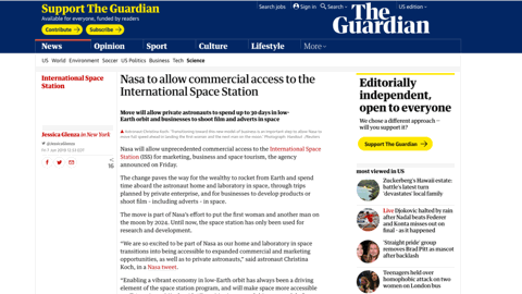
I’ll use the Guardian’s site as an example because they work around this quite well. Normally, an image will load like this, pushing content after it down whenever it arrives, and that can be terrible if you just started reading or were trying to click something below it.

The guardian folks work around this nicely by applying some box padding to represent the space the image will need. The padding is %-based and it’s using a nice hack that’s been around a while to fake an aspect ratio (see the link to Dave’s article on this above). But it’s hard to manage for every image.

Thankfully, soon we won’t need to do that anymore! At least in Firefox (so far), Jen Simmons pushed to advocate this really elegant solution where many images on the web will gain a placeholder aspect ratio before they load. Remember when we used to set
widthandheightattributes on our images? And then we didn’t need to do that anymore? Guess what. We should do it again! Any image that has width and height attributes, will get aspect ratio for free in Firefox now, holding a spot open for the image to load This is great stuff. It’s hard to think of a new feature that instantly improves old pages on the web like this.

More about images! Another challenge is getting those images lighter and served sooner.
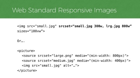
To do that… One of the best things we can do is to make sure the images in these pages are referencing are sized responsibly to have a minimal footprint. Srcset and Picture are well-supported web standards now that help us do just that. These are them. Up top you have
srcsetwith its syntax that frankly kind of looks like a build error. Andpicture, which is more readable and verbose but offers different control.
Both give you tools to serve the right size image without waste. If you don’t know srcset and picture, definitely check them out and learn the ways they help offer appropriate image sizes.
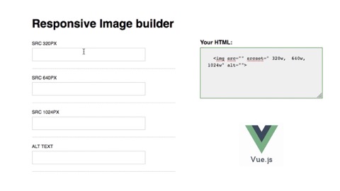
The markup for these formats is tricky to get right so having a CMS drive the code for these features on a site is ideal. However, we find a lot of teams edit the landing pages on large ecommerce sites directly in HTML, so we sometimes make tools to help ensure they get this markup correct because it’s so impactful. Recently, we’ve been using Vue.js in our documentation and pattern libraries to make components editable with live content so our clients can copy and paste their image source sizes and get the HTML markup they need.
Anything like this that we can do to remove the burdens of editing tricky HTML is going to defend the site’s performance, and responsive images are one area that are very tricky. Sometimes our performance problems can be helped with a better workflow.
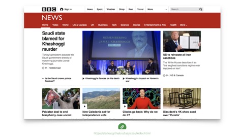
Another thing we can do to mitigate the weight of these pages is lazy loading. For example, the BBC uses a nice JavaScript solution called lazysizes, which is a project by Alexander Farkas. As you scroll down the BBC page you can see images blink into place.
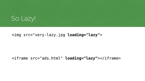
That’s a nice approach, but it does use a fair amount of scripting to pull it off. That said, there’s good news. As it turns out: we don’t need for JS to do this anymore. At least in Chrome (and Edge, etc) so far, as we now have Native lazy loading in HTML. It works on img elements and iframes! The markup couldn’t be simpler. You add a
loadingattribute and set it to “lazy”, and the browser will decide whether or not an image or iframe is close enough to the viewport to fully load it yet or not. (in fact, this article uses it!).
Small caveat: don’t use this for images that are at the top of the layout. If you do, they’ll just load later than they otherwise would. It’s great for images that are low-priority and further down in a page.

Another major blocker to perceived performance comes from fonts. That’s because the default way many browsers load web fonts right now is kind of awful. Many browsers hide the text of the page for several seconds while a custom font is loading - a behavior we often call the flash of invisible type

Here’s a web site while its fonts are loading. This page has its content, it has its CSS, it’s otherwise ready to render but Apple just doesn’t want you to see that text until it is the right font. So pretentious. This is another way we break things, I say! Browsers tend to wait 3 seconds like this by default now.
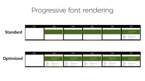
Ideally, we want a more progressive font load, that shows text early in a local font that’s available and possibly swaps to a better font when it loads, or on the next page. And you can see that the text is visible as soon as possible
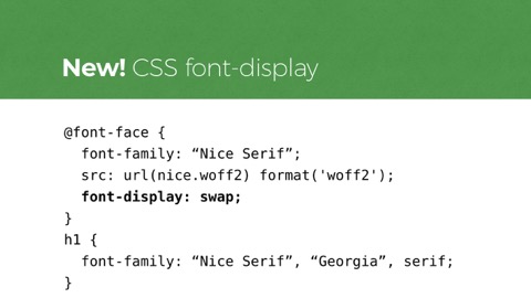
For a while, we had to do this with Javascript. Not anymore. Nowadays, we can do this with CSS alone. The new CSS
font-displayfeature covers several styles of prioritizing the way custom type renders. Here I’m showingfont-display: swap, which will immediately render text in a fallback font and swap in the custom font whenever it loads. Other values forfont-displayallow you to say things like, “okay, keep text hidden briefly to try to show the webfont. If not, just show the text in a fallback font and use the nicer font on the next page.”
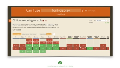
And support for
font-displayis good. And it hurts nothing in browsers that don’t understand it. Use it today!
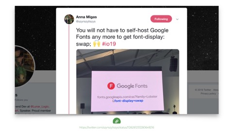
Also, Google fonts now supports it too - which is super handy if you’re already using their font service.
So an interesting thing about progressive rendering is that it really relies on fallback fonts. On that note: this is a good time to remind everyone not to use icon fonts. That’s because if 3 seconds pass and that icon font fails to load for any reason… you’re going to see a fallback for your icon. And with icon fonts, fallbacks tend to be pretty irrelevant - it’s really hard to get them right—even impossible in iOS in many situations.

I ran into this great icon font failure this spring when I was searching for a hotel in Thailand. This hotel on trip advisor had a rating of 4 fax machines and a laptop! …Which seems… not good? It also appeared to offer me the distance from my current location, by horse And is it a different distance if I go by horse? It’s all very confusing.
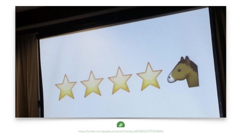
And why is it always horses with icon fonts? You’ve maybe seen this classic example from Lara Hogan, where at Etsy, a glyph for the half star wasn’t in their icon font set, so it fell back to a horse icon. “4 and horse stars!”
I’ve got one more because I live for this stuff.

The New York Times has been doing some funky stuff with their fonts lately and this one came to me on my phone. Talk about having an emoji just photobomb your serious headline with a surfer dropping in on it. For you typography nerds I call this treatment a drop-in cap.

That’s a good transition point. So far I’ve shown optimizations we use to make a site render meaningful content faster. And they really can work with a site of any weight.
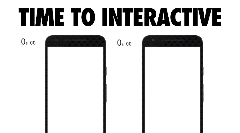
But weight does matter—and not just for the amount we pay to download heavier sites. Which brings me to the second big experience metric to care about. Time to Interactive. This metric is the time it takes for a UI to become responsive to user input, not just look that way. And it can happen relatively soon after the page appears usable, or it can take quite a while.
Increasingly, the reason for that delay is JavaScript. It’s the time we wait as scripts are evaluated, scripts that that have already been downloaded. This visualization of some popular sites’ delays is from a fantastic article by Addy Osmani of Google. The animation is by Kevin Schaaf. This demonstrates the metric we’re talking about well. It’s painful and familiar to all of us.
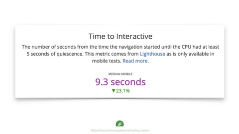
Again, this is a very real problem. The median time for Time to Interactive is 9.3 seconds. And again, medians are good but they hide outliers. Many of the most popular sites are double this number.
Folks, that’s really bad. We can do better
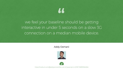
Addy notes we should be aiming for interactivity in under 5 seconds on an effective 3g connection on a median mobile device. And again, that a median mobile device is not the $1000 iPhone we read a lot about…
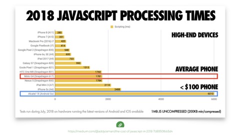
It’s that $100 or less phone. That phone that takes 6 seconds to process 200kb of compressed JavaScript (which becomes 1mb when it unpacks on the device). So that’s 6 seconds of waiting for a page to be usable, after the time it takes to deliver and appear to be ready.
There are real developer convenience issues to consider here. We’re all on the same increasingly fast networks, and things may look alright on a nice device we own, but the average phone on the same network is choking on all the javascript we send it, even if it downloads fast
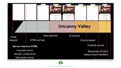
And to be clear, this is a problem even with progressive enhanced sites. Addy again, recently wrote about this. Even when a JS generated site serves server-rendered HTML, it typically serves a pile of JS along with it to update the state or more more frequently, even swaps out content entirely say for an AB test or personalization.
This pattern is common. I asked on Twitter what we should call it and Jeremy Wagner said, “first meaningless paint?” Which I think is pretty great. Anyway, you may be using React and rendering on the server, but that’s still not necessarily Progressive Enhancement-we have to come at this from an ethic of serving something usable before the JS lands, if it ever does, and treading more lightly when it does arrive.
So we need to use less JavaScript. And there are also good patterns that can help, like splitting up your scripts and loading them in smaller groups. But also! The more we can do to use native HTML behavior the better. Progressive Enhancement helps, but you know what’s even better? Needing to enhance less stuff in the first place.
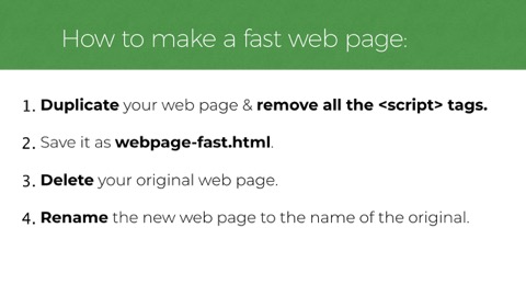
Which brings me to this regrettable 4 step process to make any webpage fast: 1. Duplicate your web page & remove all the script tags. 2. Save it as webpage-fast.html. 3. Delete your original web page. 4. Rename the new web page to the name of the original.
Okay so I can dream a little, but seriously, Yes! Maybe delete some JS! And in case you think I’m totally joking, I’m not entirely. Often, there’s deletable cruft in there. We should audit regularly.
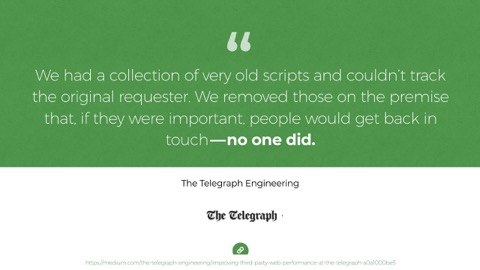
This is what the Telegraph found when they deployed this special new web methodology called “just delete stuff and see if anyone notices.” These things pile on and have a short lifespan.

So I’m not saying we can or should remove all JS. But we should aim to keep it small and the hard part is we’re not always in control. Here’s where that gets tough. We tend to work on first-party scripts most often—The stuff that lives in our GitHub repos and the scripts folder. It tends to be purposeful and more reasonable to break apart.
Third party JavaScript is a different story. In recent years, we’ve seen an explosion of 3rd party JS. These are ads, trackers, analytics, and many sites have much of their AB tests and personalized content negotiated by JavaScript on the client-side. A 706% increase in third party scripts since 2011, per Steve Souders’ article. These packages have become popular because their UIs are friendly for non-developers to use They can often can be managed without much integration with the source codebase at all. THIS is often where that Javascript weight comes from.
Friends, the hard work of performance tends to start right here. It’s defending your site after it launches, when stuff gets added to it every day. Which brings me to a sad observation.
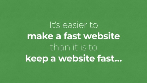
It’s easier to make a fast website than it is to keep a website fast…
And that’s because an increasing number of people on a team can impact a site’s speed with changes to many aspects of the service.
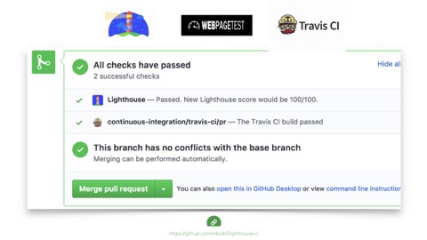
So what can we do? How do we know when we need to step in and fix things? Well, there are good tools to help us monitor and communicate problems and speed regressions across our teams today. For developers working on the source of a site, tools like lighthouse can integrate right into Github and test our changes as we build and stop regressions before going live.
But again, some of the most performance unfriendly changes happen outside of the main codebase, in 3rd party tool panels, so these tools won’t catch them.
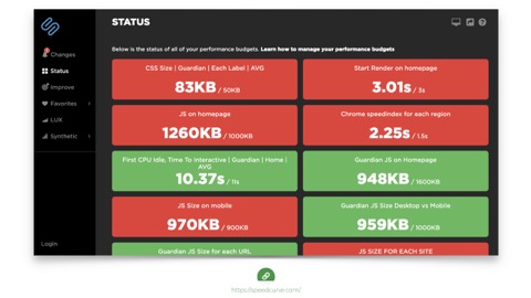
But other tools can. Speed curve and Calibre are good examples.
These tools let you set up budgets based on any performance metrics you care to retain. And their dashboard gives nice daily alerts when things are going well or over budget.Then, when a change breaks the budget, you have leverage to question its value. So that’s part of our jobs now: playing defense. Keep our teams aware of the performance impact of the things they do.
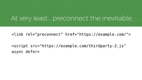
But sometimes it’s hard to convince a team to remove or defer a script that’s providing a measurable return. When we can’t remove a script, we can at least try to make it load sooner. Resource hints like
rel=preconnectcan help inform the browser to pre-connect to a third party domain that will be needed soon. Tools like this can help with network delays, getting a script to the browser a little sooner.

Okay that’s all the code I’ll be showing. Let’s recap.
I think our notion of what it means to break the user experience has shifted before, and it is shifting again right now. We’re breaking the web today for many users. But we don’t have to do that. It’s true, new web technology is exciting, but we already have the tools to build amazing things and deliver them efficiently today.
The web is good enough already. And we can take some comfort in the idea that there are resilient patterns and tools that help not only make sites fast but keep them that way.

I hope you found some useful examples in this presentation. If you want help with your site’s design, development, accessibility, or performance, feel free to reach out to us at Filament Group. Or perhaps check out my book, Responsible Responsive Design.
Thank you so much!